
Photo Tip of the Week: 3 Simple Ways to Make Your Black and White Photos Pop
- Set your camera to shoot in black and white. Although this isn’t advisable for shooting your real images (you should always shoot in color and in RAW!), for practice purposes it will be easier if you can simply look at your LCD screen to see how the image looks.
- Take an image at normal exposure. Dial down the exposure on your camera one stop and take another picture. Dial it down again and take a third picture. Compare the three to see how underexposing your image results in deeper blacks and brighter whites.
- Once you’ve examined how exposure changes your image, find a graphic element to include. Remember to look for lines, shapes, textures, and other elements that add visual interest.
- Also look for something to serve as a focal point. Even in the absence of having a strong graphic element in the frame, a focal point can serve as enough for the viewer’s eye to find the image interesting.
- If you find that your image still lacks punch, look for graphic elements or focal points that are high in contrast. The more contrast, the more it will make up for a lack of color.

Composing quality black and white photos takes a little bit of know-how and a whole lot of practice. But that doesn’t mean that getting your images to pop has to be difficult and time-consuming.
This week’s Tip of the Week focuses on three easy-to-implement methods for boosting the drama in your black and white images.
Slightly Underexpose
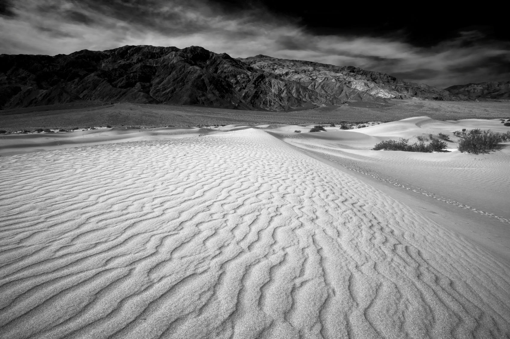
Underexposing your black and white images by one, two, or even three stops will have a dramatic effect on how the blacks, grays, and whites are presented in the shot. Let’s use the image above as an example.
By underexposing the image, the photographer turned the relatively flat sky to black. The mountains in the background also become darker, and, in the process, make the gray clouds pop. Underexposing the image also reduces the brightness of the sand in the foreground and prevents it from being blown out. This gives real drama to the scene. The nice contrast between the illuminated ripples in the sand and their adjacent shadows also provides some very nice visual interest, while leading the eye deeper into the shot as well.
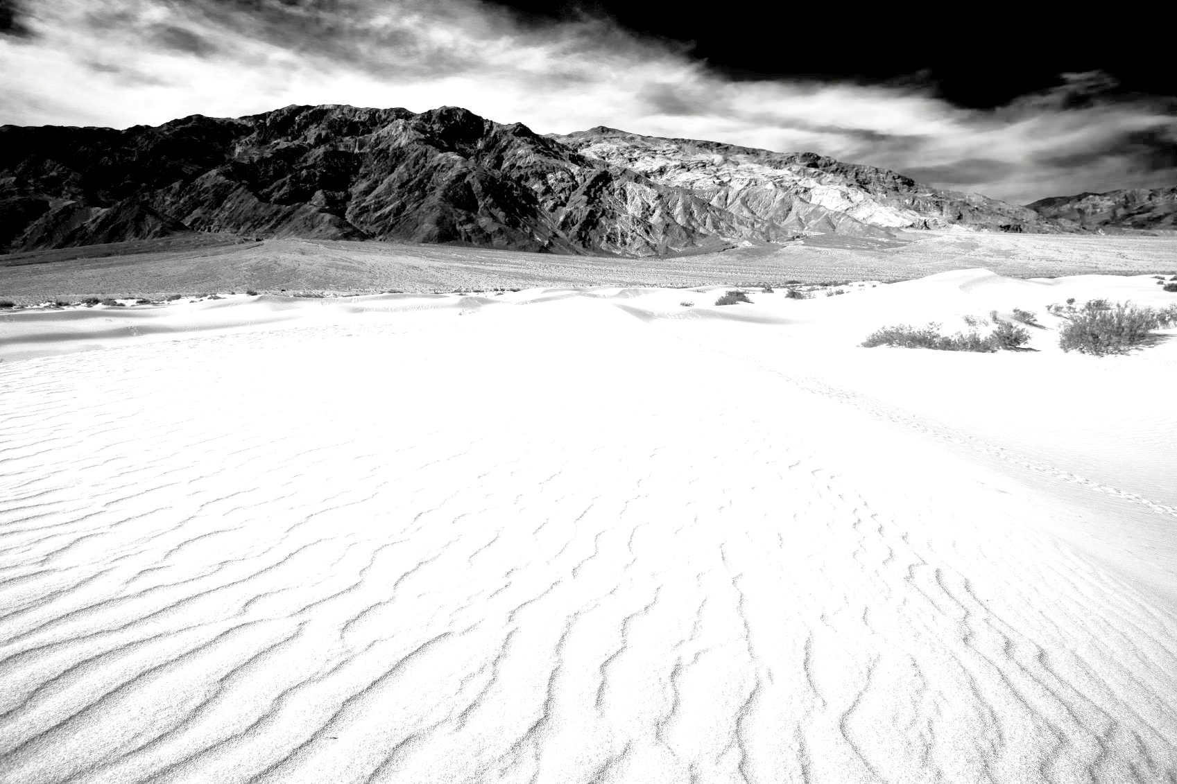
Had this image been exposed normally, as seen above, the foreground would have been blown out and the mountains would have lacked the deep blacks. Middle grays would have taken over, and, as a result, the image would suffer from a lack of contrast and depth of tonality.
Use Graphical Elements to Punch Up the Drama
Supercharge your photography skills. 600+ Premium lessons waiting for you HERE.
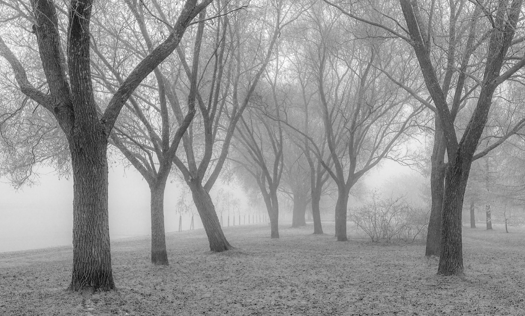
With a lack of color, black and white photographs need something to tease the eye and give it something to look at, otherwise the image can be on the boring side. As you can see in the image above, there is a graphical element with the inclusion of the trees, but the image still lacks punch. Clearly, simply adding a graphical element doesn’t guarantee that your image will have more interest.
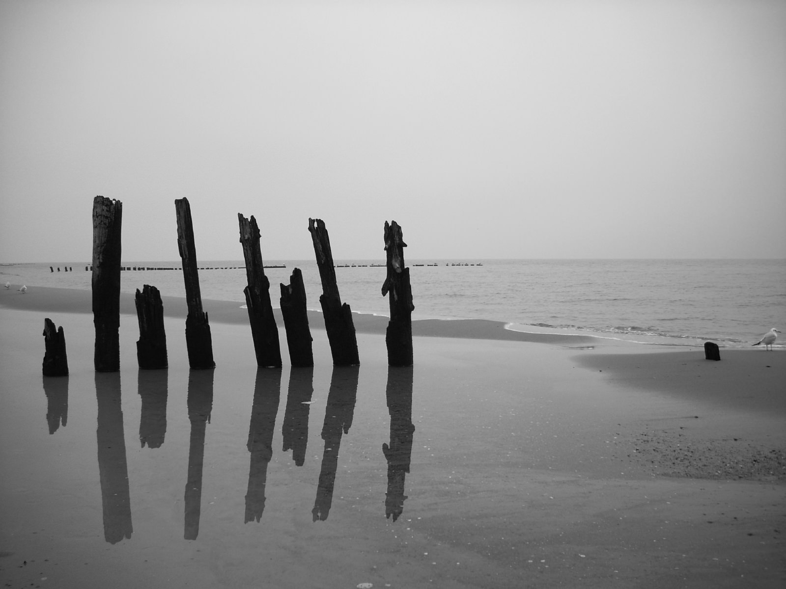
In the image above, the photographer utilized the old piers to bring a much-needed element of contrast to an otherwise minimalistic and flat scene. From foreground to background, the image is nothing but shades of gray. However, black is introduced into the image with the inclusion of the piers. Additionally, the linear nature of the piers and the fact that they are perpendicular to the horizon line give the shot the graphic element it needs to be more interesting.
Have a Strong Focal Point
Having a strong focal point on which viewers’ eyes are drawn is a basic rule for all photography. However, it is even more important for black and white photography because of the lack of color. Without a strong color to highlight your focal point, you will need to rely on contrast instead.

To highlight the importance of contrast, inspect the image above. Despite having the sails of the boat displayed prominently, this image lacks the contrast necessary to make the lines and shapes of the sails really pop. The result is an image that has a graphic element, but one that isn’t strong enough to do much in the way of visual interest.
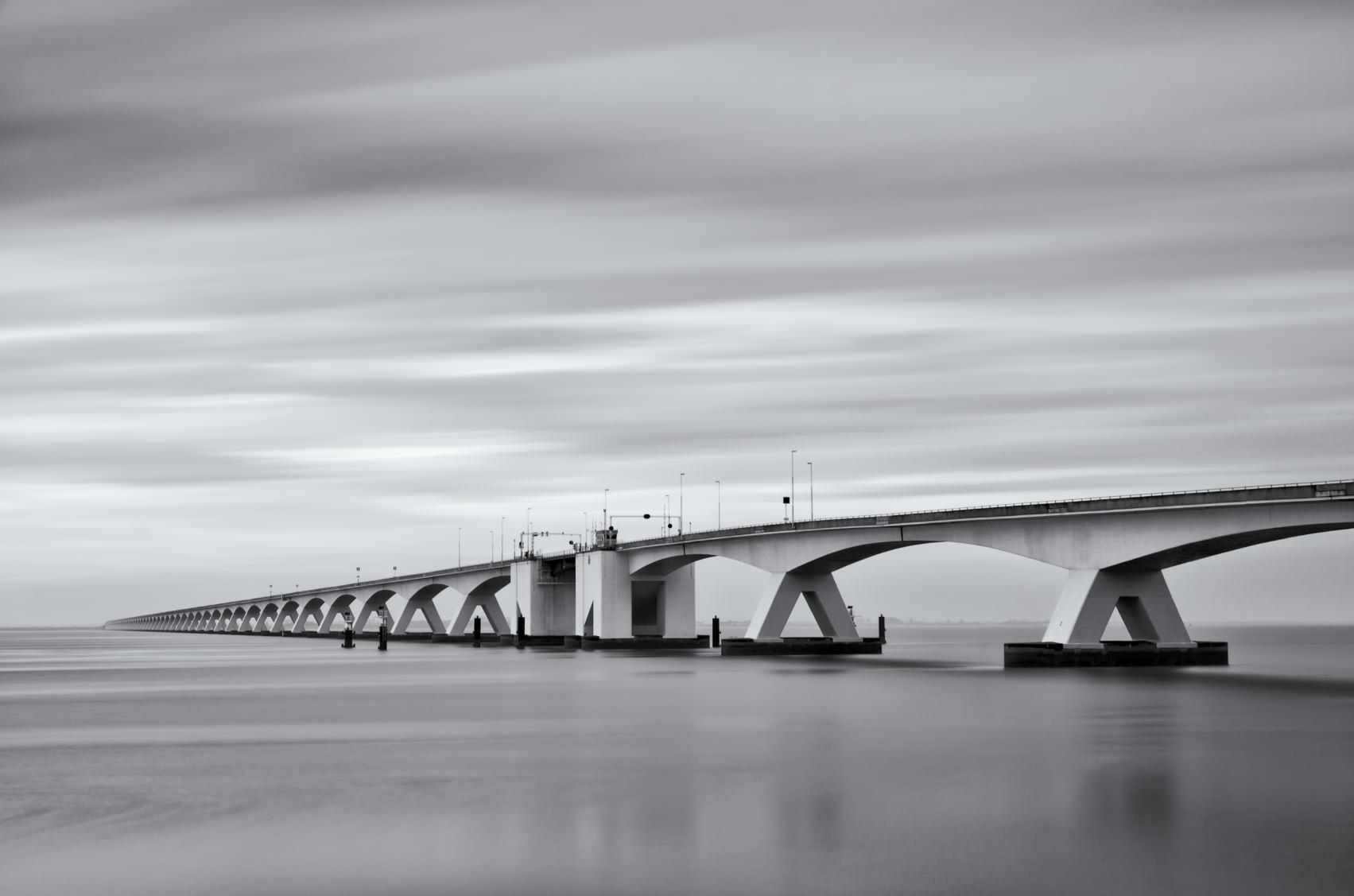
Conversely, in the image above, the bridge clearly serves as the focal point of the shot, but not just because of its prominent position in the foreground and it’s strong graphic element with the repeating archway. What makes this focal point pop is the contrast of the whites along the side of the bridge against the deep blacks underneath the bridge’s archways. This immediately draws the eye inward into the shot, while also serving as a visual barrier between the sea and the sky, which lack much differentiation in tone.
Want more premium photography lessons? Click HERE.
Conclusion
As you can see in the example images included in this lesson, there is a fine line between a black and white image that is flat and boring, and one that really pops. If you underexpose your image, you will deepen the blacks, which, in turn, will make the whites appear brighter. Adding graphical elements and focal points will also punch up the drama, but only if they do so with some contrast. Now that you’ve got the basics down, head out and practice using these techniques to get better black and white images!