

Black and white photography has a funny way of making you notice what you missed the first time. You stop thinking about color and start paying attention to light direction, facial expression, and the shape of a shadow. A scene that felt busy in color can feel calm and intentional in monochrome. That shift is addictive because it feels like you are seeing more, not less.
Most of us, though, judge black and white photography almost entirely on screens. Screens are fast, bright, and forgiving. They can make weak tonal choices feel dramatic, and they can hide subtle problems in the midtones. If you only view your work on a glowing display, you are not getting the same experience your audience gets when the image becomes an object.
Printing changes the rules. A print reflects light instead of emitting it, and that difference affects mood, contrast, and perceived detail. When you print black and white photography, you see your tonal decisions with fresh eyes, and you feel the image more strongly because it occupies real space. This article shows why prints amplify mood and contrast, and how to use paper choice and presentation to make your monochrome work land the way you intended.
Table of Contents
- Why Black and White Photography Feels Different From Color
- Why Screens Cannot Fully Show Black and White Photography
- How Prints Amplify Mood in Black and White Photography
- The Power of Contrast in Printed Black and White Photos
- Texture and Detail Come Alive in Prints
- Choosing the Right Paper for Black and White Prints
- Fine Art Paper Prints From Artbeat Studios
- Why Printing Improves Your Black and White Editing Skills
- Creating Gallery-Style Displays With Black and White Prints
- Giving Your Monochrome Work a Real-Life Home
- FAQ
Why Black and White Photography Feels Different From Color

Photo by Rawpixel.com via Shutterstock
Black and white photography simplifies the visual problem your viewer has to solve. With color removed, the eye looks for structure, and structure is built from edges, shapes, and tonal separation. Lines become more important, and so does the way highlights fall across a subject. Even simple scenes can feel designed because the viewer is guided by light instead of hue.
Emotion often reads more clearly in monochrome. In portrait work, color can pull attention toward clothing, lipstick, or a bright background. In black and white photography, expression and gesture take over, and small cues feel louder. A slightly raised eyebrow, a hand resting on a chair, or the direction of someone’s gaze can become the entire story.
Monochrome also changes the sense of time. Color is one of the strongest signals of era, because it captures trends in clothing, signage, and lighting. When you strip that away, a modern frame can feel timeless, and a viewer can focus on the human element. That timelessness is one reason black and white photography feels so at home on a wall as a print.
Why Screens Cannot Fully Show Black and White Photography

Photo by NDAB Creativity via Shutterstock
Screens are made of emitted light, and that matters for monochrome. Emitted light gives images punch by default, especially in dark rooms. Blacks can look deeper than they truly are, and highlights can look cleaner than they actually are. Black and white photography can look “finished” on a screen even when the tonal structure is not stable.
Brightness settings also cause trouble. Many monitors are set too bright for print work, and many photographers edit in bright rooms where the display looks dim unless it is cranked up. The result is predictable. You edit an image to look good on a bright monitor, then you print it and it comes out darker than expected. Once you start printing regularly, you begin to edit toward reflected light instead of screen glow.
The biggest loss on screens is often the midtones. Midtones carry depth, and they are where skin, clouds, concrete, and fabric live. Viewing angle, glare, and display quality can compress those subtle transitions. Printing black and white photography removes many of these variables and lets you judge tone in a consistent, physical way.
How Prints Amplify Mood in Black and White Photography

Photo by Ionut Musca via Shutterstock
A print has presence. It occupies space and encourages slower viewing, which changes how mood lands. When someone holds a print or stands in front of a framed piece, they are not swiping and scrolling. They are looking, and that pause gives your tonal choices time to work. Black and white photography benefits from that pace because mood often lives in subtle transitions, not in instant impact.
Reflected light also feels natural. Highlights on paper do not glow; they sit on the surface, and that creates a calmer experience. Shadows feel grounded rather than luminous, and the whole image can feel more believable. If your intent is quiet, intimate, or contemplative, printing often gets you closer to that feeling than a screen ever will.
One of my favorite personal checks is to place a print in a room and walk past it a few times during the day. Morning light, afternoon light, and warm evening light change how the tones feel. If the mood holds up in different conditions, the image is strong. That kind of real-world test is one reason printing black and white photography can sharpen your instincts quickly.
The Power of Contrast in Printed Black and White Photos

Photo by Wirestock Creators via Shutterstock
Contrast is the steering wheel in black and white photography. It directs attention, separates subject from background, and sets emotional tone. High contrast can feel bold and energetic, while low contrast can feel soft and quiet. Printing forces you to judge whether the contrast you created is doing what you think it is doing.
Paper reveals midtone separation in a way screens often hide. Two areas that look distinct on a monitor can merge on paper if your midtones are too close together. That is not always fixed by “adding contrast” globally. Often it is fixed by targeted dodging and burning, or by shaping the tonal curve so midtones have room to breathe.
Prints also punish crushed shadows and clipped highlights. In black and white photography, the temptation is to chase deep blacks for drama. Deep blacks can be beautiful, but if they swallow texture and shape, the image loses depth. A strong print usually shows clean whites, rich blacks, and a full range in between, with transitions that feel intentional rather than accidental.
Texture and Detail Come Alive in Prints

Photo by PraveenV via Shutterstock
Texture is a primary language in black and white photography. When color is gone, texture carries information about place, age, weather, and emotion. Wrinkles in fabric, scratches on a door, rain on pavement, and the grain of wood can become the subject. Printing enhances this because paper has a physical surface that complements textured imagery.
Detail also reads differently in print. Screen sharpness can look brittle because pixels create hard edges, and the display adds its own contrast. In print, detail can look more natural when your sharpening is tuned for the output size. This is why photographers often change their export approach after they begin printing black and white photography regularly.
Portraits are a great example. People worry monochrome will make skin look harsh, and it can if you overdo clarity or contrast. A print helps you find balance. You can keep honest texture while still maintaining flattering transitions by controlling local contrast rather than pushing global sliders too far.
Choosing the Right Paper for Black and White Prints
Paper choice is not a minor finishing detail. In black and white photography, paper affects perceived contrast, highlight roll off, and the way shadows sit. The same file can feel punchy on one surface and gentle on another. If you want consistent results, you need to treat paper as part of the creative decision.
Glossy paper tends to boost perceived contrast and crispness, which can be great for bold street scenes or dramatic portrait lighting. The tradeoff is glare, especially in bright rooms or near windows. Luster paper often balances contrast with reduced glare, making it a practical choice for many monochrome images that will be displayed in everyday spaces.
Metallic papers can add depth and a subtle luminosity that makes highlights feel more alive, depending on the image. Fine art cotton papers often produce softer transitions and a more tactile, gallery-oriented look. If your black and white photography leans quiet, intimate, or minimalist, fine art paper can support that mood in a way glossy paper cannot.
Fine Art Paper Prints From Artbeat Studios

Photo by mamaza via Shutterstock
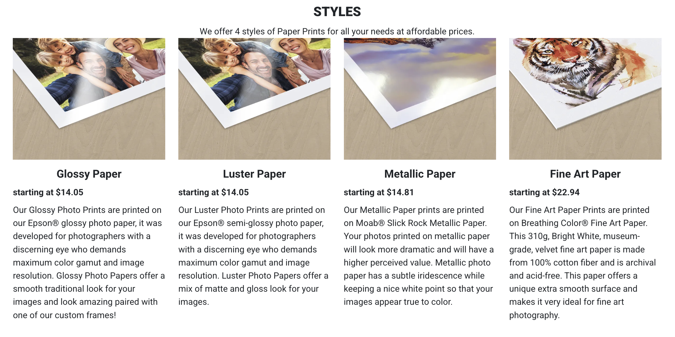
If you want a concrete example of how paper choice changes output, Artbeat Studios offers four paper styles that map well to different monochrome goals. Their Glossy Paper prints use Epson glossy photo paper designed for strong color gamut and high resolution, and in monochrome that often translates to crisp detail and strong perceived contrast. Their Luster Paper prints use Epson semi-glossy paper that sits between matte and gloss, which can help you keep contrast while reducing distracting glare in typical home lighting.
For photographers who want a bit more drama, Artbeat Studios offers Metallic Paper prints on Moab Slick Rock Metallic Paper. Metallic surfaces can add a subtle iridescence and a clean white point, which can make highlights feel luminous even in black and white photography. If your work is tonal and nuanced, their Fine Art Paper prints use Breathing Color fine art paper, a 310g bright white, museum-grade, velvet paper made from 100 percent cotton fiber. It is archival and acid-free, which matters if you want your prints to last and if you want shadow transitions to feel smooth rather than harsh.
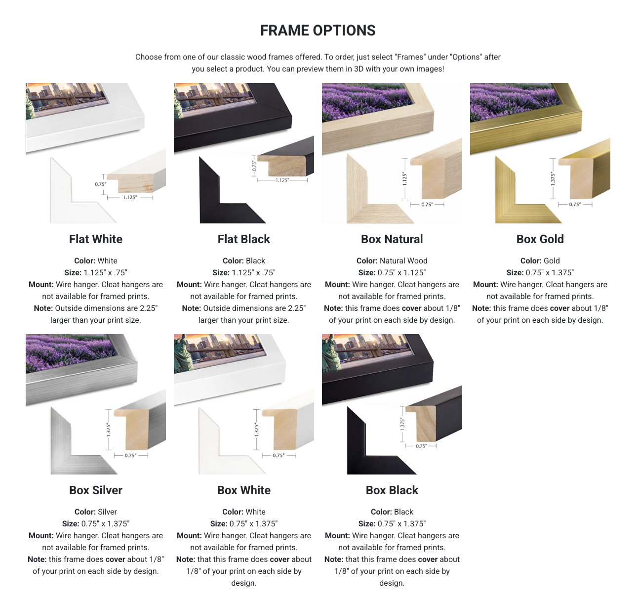
Presentation options matter, too. Artbeat Studios offers classic wood frames, including Flat White and Flat Black, plus box-style finishes like Natural Wood, Gold, Silver, White, and Black. They also offer matting options in black or white, in 2 inch, 3 inch, or 4-inch widths. Matting can increase the sense of space around an image and can help black and white photography feel more deliberate and gallery-like, especially when you choose mat color based on the tones in the print.
Why Printing Improves Your Black and White Editing Skills

Photo by Wirestock Creators via Shutterstock
Printing is one of the fastest ways to improve your monochrome editing, because it removes excuses. A screen can make a heavy-handed edit look punchy. A print will show you if you crushed the blacks, clipped the whites, or lost midtone separation. If you want your black and white photography to improve, print review is a reality check you can repeat.
A practical approach is to print two versions of the same file with small differences, then compare them under the same light. One version might have slightly lifted shadows. Another might have gentler highlights. In print, the better choice is usually obvious. Over time, you start making those better decisions earlier in your edit, because you have trained your eye through physical feedback.
Printing also encourages restraint. It becomes clear that strong monochrome often comes from careful local adjustments, not from one aggressive slider. Dodging a cheekbone, burning a bright corner, or shaping the midtones to separate subject from background can do more than global contrast. This is how printing black and white photography helps you build control instead of relying on blunt tools.
Creating Gallery-Style Displays With Black and White Prints

Photo by baitong333 via Shutterstock
Once you commit to printing, you start thinking about how work lives in a space. Black and white photography is especially friendly to home display because it fits a wide range of interiors. It can feel modern, classic, minimal, or warm depending on the framing and matting. This makes it easier for viewers to say yes to putting a print on a wall.
A gallery-style display is not just about a single hero print. It is about pacing and the relationship between images. A small set of prints can tell a story through rhythm, contrast, and subject variation. You might pair a close portrait with a wider environmental frame, or mix soft tonal images with one bold, high contrast piece. Printing black and white photography gives you the ability to lay work out, rearrange it, and see what holds together.
Frames and mats play a bigger role than most people expect. A black frame can emphasize drama, while a white frame can feel airy and quiet. A wider mat can slow the viewing experience and add breathing room. When you treat presentation as part of the final image, your black and white photography feels more finished and more intentional.
Giving Your Monochrome Work a Real Life-Home

Photo by Mike_O via Shutterstock
Black and white photography has always had a natural home in print, because monochrome is built on tone, not on glow. Printing makes tone feel real. It makes mood feel physical. It also creates an object that can be shared, gifted, and lived with, which is a different kind of value than a file stored in a folder.
If you want a simple habit that pays off, pick a small number of images each month and print them. Put one on your desk. Frame one for a hallway. Keep a few in a portfolio box. You will start noticing what holds up over time and what does not, and that feedback will shape how you shoot and edit. This is a practical way to build consistency in black and white photography without chasing trends or overthinking gear.
Printing is also a commitment to your own work. It says the image is worth space and attention. If you have ever felt stuck, printing with a company like Artbeat Studios can be a reset because it changes how you evaluate success. When black and white photography becomes physical, you stop chasing quick reactions and start building photographs that hold up to real looking.
FAQ
Why Does Black and White Photography Often Look Better in Print?
Prints reflect light rather than emit it, which makes tones feel calmer and more natural. That reflected light can reveal midtone separation and texture more clearly than a bright screen.
What Paper Finish Is Best for Black and White Photography?
It depends on the mood you want. Glossy and metallic finishes often increase perceived contrast and crispness, while fine art cotton paper can give smoother tonal transitions and a softer feel.
How Do I Avoid Prints That Look Too Dark?
Start by lowering your monitor brightness and editing with print in mind. Printing small test copies and adjusting based on results is usually the fastest path to consistent output.
Do Frames and Mats Really Matter for Monochrome Prints?
Yes. Frame color and mat width change visual weight and how the eye enters the image. They can increase focus and make the print feel more intentional in a room.
Friendly disclaimer: Our articles may contain affiliate links that support us without costing you more, and sometimes we spice things up with sponsored content—but only for products we truly stand behind!
Hero photo by Thomas Dutour via Shutterstock