Photography

12 years 1 month ago - 12 years 1 month ago #214852 by nedward50
Any thoughts, critiques of these 2 images from technical to emotional please. Do not hold back, tell it like you see it.


Attachments:
,
12 years 1 month ago #214855 by Darrell
Love #2 :judge: :judge: Framed Beautifully !!!:judge: Contrast and lighting are great !!

You will not be judged as a photographer by the pictures you take, but by the pictures you show.
The following user(s) said Thank You: nedward50
,
12 years 1 month ago #214864 by Rob pix4u2
#1 makes me feellike there is too much going on but that may be just me

Remember to engage brain before putting mouth in gear
Rob Huelsman Sr.
My Facebook www.facebook.com/ImaginACTIONPhotography

The following user(s) said Thank You: nedward50
,
12 years 1 month ago #214870 by chasrich
Number 1 has three subjects in it... The most powerful is the tree branches which are in sharp focus, the church which has a softer focus comes in second and the third is almost overlooked because it is so subtle... the dramatic shadows of the trees in the church.

I suppose one could argue that the branches are necessary to produce the shadows but - if you came out of hyperfocus and placed a narrower DOF on the front of the church you might be able to promote this subject into number one position. Eliminating the branches all together might work just as well. I love the shadows of the tree on the church.

Number two is also a bit busy again with four subjects. I can see an artistic tie in for all four and the tree branches in this case are just part of the background.

:judge: :judge: :judge:

“Amateurs worry about equipment, professionals worry about money, masters worry about light, I just make pictures… ” ~ Vernon Trent
The following user(s) said Thank You: nedward50
,
12 years 1 month ago #214889 by Pixelchix
Number 2 does nothing for me at all. Too dark. I think number 1 would look cool with it being a full moon and making the same shadows


The following user(s) said Thank You: nedward50
,
12 years 1 month ago #214893 by fed5du
I like the first one with the shadows on the church, but I do not like the branches in the photo. The 2nd one IMO is too dark.


The following user(s) said Thank You: nedward50
,
12 years 1 month ago #214902 by nedward50
What fabulous feedback, thank you all. If you will allow a block reply?
The darkness in both was intended, both in terms of contrast and emotion. The bw on my back lit monitor has detail in the shadows, but the monitor remains uncalibrated and I've had problems with contrast in the past so it could translate poorly.
I agree with all that no.1 is very fussy and difficult, there is a lot going on. Charles has given an enlightened and in my opinion well explained comment and I concur with it all.
The tree branches at the top of no.1 were unavoidable from this position everything else was intentional and compromised simplicity. I won't bore you with why I took them the way I did.
As always I'm grateful for all your feedback as it helps me understand what messages you receive as viewers.
Without credentials in art or photography I rely on others. Again Charles thanks for seeing an artistic link. Damien Hurst reckons there is no art in any subject. The art is brought by the viewer. Whom am I to argue:agree:
Back to the drawing board for me.
Ned
,
12 years 1 month ago #214936 by KCook
Looks like I'm late to the party :silly: (My penalty for living on the westcoast of North America)

I agree with the other comments on #1 being overloaded.

However #2 is pretty darn close to goodness. :thumbsup: My thoughts are that there is still a clutter factor holding it back. My fix would be to either (but not both): 1) Change the camera location so that the tombstones in the foreground are gone, or are much smaller (telephoto solution). 2) Change the time of day for the shot so that the shadows on the face of the church do not cover the whole church. As the shot stands, the prominent tombstones and the shadows kind of get in each other's way.

Kelly

Canon 50D, Olympus PL2
kellycook.zenfolio.com/

The following user(s) said Thank You: nedward50
,
12 years 1 month ago #214947 by icepics
The first one seems like the focus needs to be on the shadows/the church. I'm assuming you converted the second one; to me the conversions look more grayscale than B&W. I like the composition of the second and in the first one I see what you're going for. If you photograph this subject again I think you're on the right track, it's a matter of getting the image more clear and figuring out settings for what seems to be some mixed lighting conditions.

Sharon
Photo Comments
The following user(s) said Thank You: nedward50
,
12 years 1 month ago #214985 by John Landolfi
I agree with Charles on No1, and with his approach to modify it. I would also straighten it both horizontally and vertically, to increase its weight. In no2, I think it is the composition that detracts from the whole- it doesn't seem to allow the eye to linger, but leads it out of the frame.:thumbsup: :cheers:


Photo Comments
The following user(s) said Thank You: nedward50
,
12 years 1 month ago #215007 by photobod
On 1 I am in total agreement with Charles, on 2 I am very biased when it comes to B&W as I love it and to me it is obvious the darkness is intentional, so for me its a winner. :woohoo: :woohoo: :woohoo:

www.dcimages.org.uk
"A good photograph is one that communicate a fact, touches the heart, leaves the viewer a changed person for having seen it. It is, in a word, effective." - Irving Penn

The following user(s) said Thank You: nedward50
,
12 years 1 month ago #215035 by nedward50
Woweee, what great feedback again!
In the attached shot there's revamp incorporating some of your comments. Shot at the same time as t'others.

Kelly, yes yes yes, barriers to the church! but too many, shadows,darkness, no straight and narrow. I removed some of them in later shots. Johns right about the converging verticals, only acceptable in worms eye view from the foot of say the Eiffel Tower, and as for leading the eye out of the frame, completely unintentional on my part. photobod, yes I like darkness as well however the extent I apply it is not properly quantifiable until i sort my monitor calibration. I so seldom print anything I don't have a printer its a real handicap to seeing what things look like. icepics the softer focus building was partly intentional in as much as it didn't matter as the emphasis was on barriers...well at least in my mind, and yes later converted to b/w but considered as shooting.

Shot 1 was was purely speculative and is too "heavy" with too many factors trying to convey thoughts and emotions. shot 2 was more considered as the thoughts bumped round my head on site. The shadow on the building was supposed to convey something sinister as well as being recognisable as a tree.

I probably over complicate the whole process in this insanity I carry (thats a metaphor for passion of photography by the way) wish sometimes I could throw a switch to a simpler approach. As always i'm grateful for you taking time to view and comment. I don't think the images here were really about religion or churches/architecture per say but a metaphor for my struggle with photography. All subconscious.....Freud could't straighten me out I'm afraid.

Here's the simpler shot with less time spent developing it.

Attachments:
,
12 years 1 month ago #215048 by KCook
Humm, I had not heard of the "barrier" concept before. Humm.

Anyhoo, I think #3 is a big improvement. Got those pesky tombstones to stand back out of the way. Still think the shadows on the church are too heavy handed. It would be an interesting exercise to re-shoot this, same time of day, but at 10 minute intervals to see just what shadow position would give the nicest effect. My monitor is calibrated, tones are pretty close for a low-key picture, which I assume was the goal. The darkest edges of the shadows (structural shadows, not tree shadows) could be brought up a little. Some of the mid-tones, such as the tombstones, could be darkened a little. But that is tricky. As the sky also has these mid-tones, and it is already about bang-on where I would want it. So the mid-tone dodging would have to be exactly that, not an image wide filter.

fussy

Canon 50D, Olympus PL2
kellycook.zenfolio.com/

,
12 years 1 month ago #215052 by John Landolfi
I like this better, too. I'd still correct the verticals with a Free Transform layer, and correcting the midtone contrast is relatively easy with High Pass filter at failry high radius, followed by As If blending to apply just to the midtones.:thumbsup: :cheers:


Photo Comments
,
12 years 1 month ago #215068 by Rob pix4u2
The third one works for me as well it isn't as busy as the first one and the shadows work well

Remember to engage brain before putting mouth in gear
Rob Huelsman Sr.
My Facebook www.facebook.com/ImaginACTIONPhotography

,

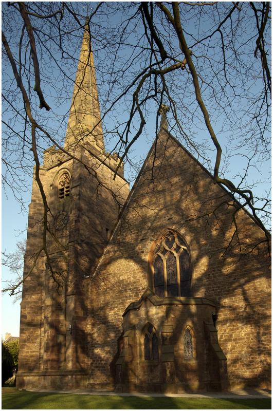
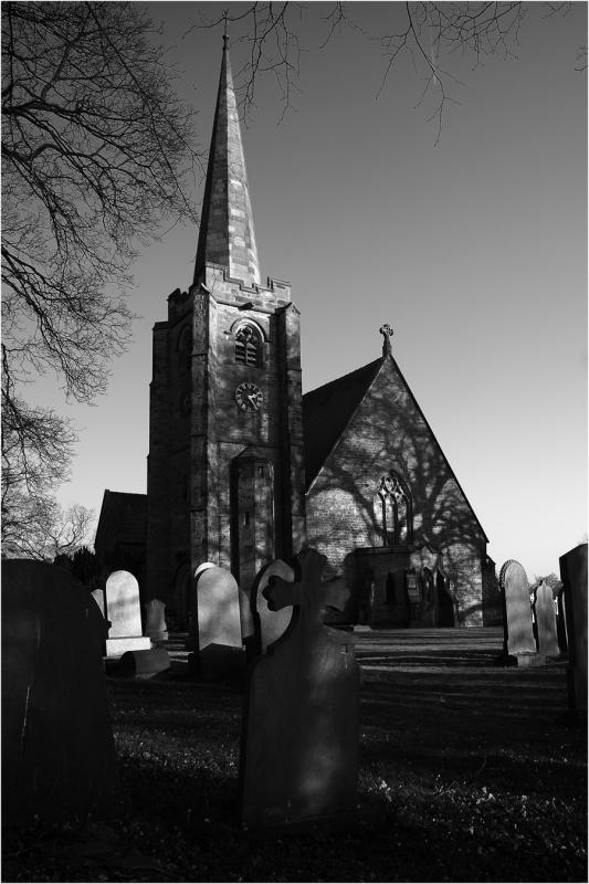
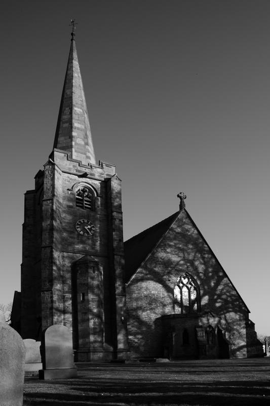
Latest Landscape Photography Tips

817.3K

241K

  • Facebook

    817,251 / Likes

  • Twitter

    241,000 / Followers

  • Google+

    1,620,816 / Followers

Latest Reviews

The Canon EOS R100 is an entry-level mirrorless camera introduced in 2023. But just because it’s an entry-level camera doesn’t mean it’s a bare-bones camera. Find out why in this review!

Apr 22, 2024

Nikon’s retro-looking Nikon Zfc is anything but retro. Under its classic body is a host of features and amenities that make it a worthwhile compact mirrorless camera for 2024.

Apr 15, 2024

The Canon EOS R50 is one of the newest R-system cameras from Canon. Is it worth your money? Find out all the details you need to know in this comprehensive review.

Apr 10, 2024

The Sony FE 70-200mm f/2.8 GM OSS II is Sony’s flagship mirrorless zoom lens. As such, it’s loaded with features and has a top-shelf build quality that makes it a top pick!

Mar 27, 2024

Forum Top Posters

Latest Articles

Using leading lines in photography helps improve the composition by drawing viewers in and leading their eye from the foreground to the background. Explore some fine examples of this in this guide!

Apr 24, 2024

The Insta360 has one of the best lineups of action cams and 360-degree cameras. With these Insta360 accessories, you can elevate your photography and videography game!

Apr 24, 2024

Creating impactful photos of landscapes depends on many factors, not the least of which is your talent behind the lens. This guide explores other elements required for the best product.

Apr 23, 2024

The Canon EOS R100 is an entry-level mirrorless camera introduced in 2023. But just because it’s an entry-level camera doesn’t mean it’s a bare-bones camera. Find out why in this review!

Apr 22, 2024

Are you ready to upgrade your camera? Before buying new, you might consider the value of purchasing used gear to save money.

Apr 18, 2024

The Olympus OM-D E-M10 Mark IV is a micro four thirds camera released in 2020. It’s an entry-level system along with the OM-D E-M5 Mark III. Use this guide to determine which one is best for you!

Apr 17, 2024

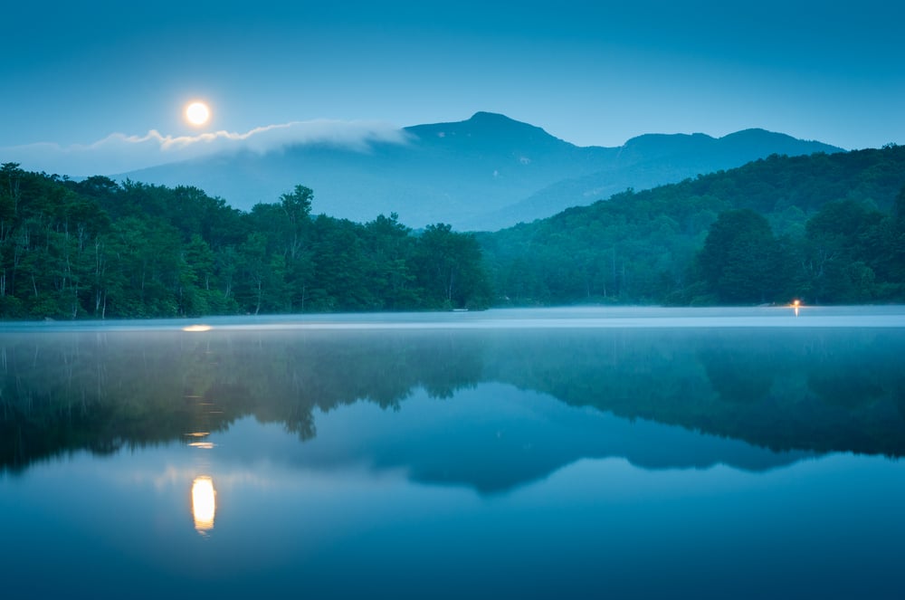
Blue hour photography might not be as well known as golden hour photography, but it is every bit as good a time to create epic images of landscapes. Learn how in this quick tutorial!

Apr 17, 2024

Nikon’s retro-looking Nikon Zfc is anything but retro. Under its classic body is a host of features and amenities that make it a worthwhile compact mirrorless camera for 2024.

Apr 15, 2024