- Forum
- Photography and Camera Forum
- Photo Galleries - For General Display or Critique
- People Photography
- Jennifer
Jennifer
-
 Topic Author
- Leilanee
- Photography Hooked
-
- Canon EOS 6D
- Followers: 96
- Posts: 783
-
Points:
634
-

- KCook
- Photo Elder
-
- Canon EOS 50D and Olympus E-P5
- Followers: 1325
- Posts: 5410
-
Points:
32913
-

- rmeyer7
- Master of the Lens
-
- Canon 6D, Canon 5D mk. ii, Canon 50D
- Followers: 105
- Posts: 1640
-
Points:
2086
Post #288862
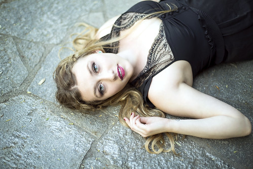
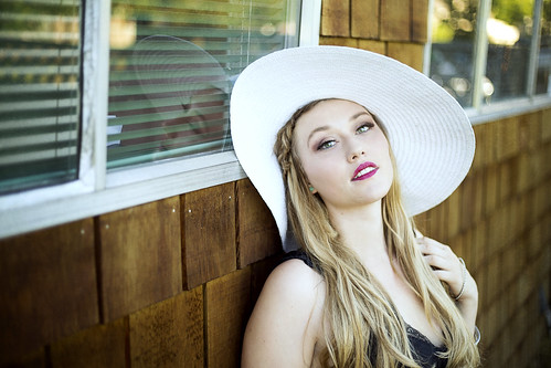
#1 - I might like a little more space at the top of the frame, it's cropped very close to your model's body.
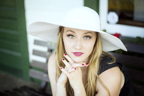
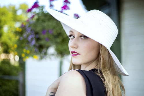
#2 and #3 - the colors of the flowers behind her pull my eyes away a little.
#3 has a weird bokeh pattern to my eyes, probably the "nifty fifty"?
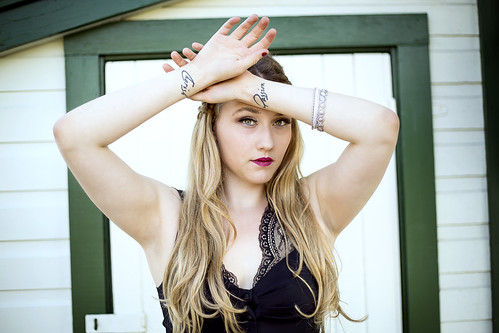
#4 - the background doesn't do anything for me. Maybe it's the partial sloping roof/eave on the top left and the dark space next to the building on the right.
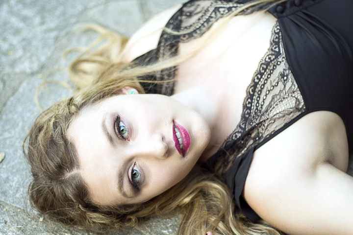
#5 - I think you've mentioned you like the reflection-in-window style before. It's not my thing personally, but it works ok here. I might have also tried posing her in the third of the frame closest to the camera and having her look off toward the right of the frame to make interesting use of the negative space.
Also in various parts of several of these, particularly the hat, some of the whites seem a little blown. But I have a feeling that's more of a style choice, not really a mistake. The only ones where it bugs me a little are #2 and #3, where parts of the hat almost disappear into the background.
But again - I think these all look good. I consider these minor things that reflect my personal taste more than anything.
-
 Topic Author
- Leilanee
- Photography Hooked
-
- Canon EOS 6D
- Followers: 96
- Posts: 783
-
Points:
634
Post #288871
rmeyer7 wrote: Overall, very nicely done. A few minor critiques - just my opinion of course.
#1 - I might like a little more space at the top of the frame, it's cropped very close to your model's body.
#2 and #3 - the colors of the flowers behind her pull my eyes away a little.
#3 has a weird bokeh pattern to my eyes, probably the "nifty fifty"?
#4 - the background doesn't do anything for me. Maybe it's the partial sloping roof/eave on the top left and the dark space next to the building on the right.
#5 - I think you've mentioned you like the reflection-in-window style before. It's not my thing personally, but it works ok here. I might have also tried posing her in the third of the frame closest to the camera and having her look off toward the right of the frame to make interesting use of the negative space.
Also in various parts of several of these, particularly the hat, some of the whites seem a little blown. But I have a feeling that's more of a style choice, not really a mistake. The only ones where it bugs me a little are #2 and #3, where parts of the hat almost disappear into the background.
But again - I think these all look good. I consider these minor things that reflect my personal taste more than anything.
Thanks for the feedback! Just to reply to that:
#1 I agree, and I actually have a tighter crop (headshot of that) that might look better? I'll edit and upload it when I get home from work.
#2 again I can see that... Black and white might fix that though... I was wanting to do a B&W of one of these
#3, I like the colourful flowers in this one
#4 makes sense, I wanted her framed by the door frame but I made a wider crop for the pose
#5 thank you! I do love the reflection shots. I dunno about having her in the other third though D:
I did intentionally overexpose, but I did also regret it once I saw the hat in almost all of these. If you look closely, I tried to burn a bit if detail back in but it added a bright blue tone to it that I didn't like so I kept the burning quite low key
Glad you like them!
-

- garyrhook
- Oh Wise One
-
- Nikon D850, Nikon D750, Panasonic G7K
- Followers: 912
- Posts: 11103
-
Points:
67681
Post #288884
1) Like this, perhaps?
But get rid of the right hand fingertip.
2) Selectively desaturate the red flower, perhaps? Or change it's color toward orange to soften it? Agree that it distracts from the model. To my eye, the main problem is the entire upper right section: window, sticker, flower, etc. Doesn't work for me.
3) Agree about the weird bokeh pattern. The flowers are nice, but the don't really work here; there aren't enough of them. Too many things going on that compete for attention.
4) The problem is not the doorway; we get the intent. The problem is the roof line and the thin dark slice on the right. They detract. And the tilt isn't enough to be artsy; it just looks.... well, wrong is the nicest way I can put it. I'd have rather seen her up against the door, framed, with the siding included (landscape format) and no eave. Strong, simple color and line elements against which you place your subject. Then she'd pop.
5) Didn't even notice the reflection when I first saw this. I rather like it here, but it's minor to my eye. I like the shingles, but the aluminum frames don't work for me. I'd crop tighter to remove the tattoo. It's distracting as is.
On the whiteness of the hat, LR might be able to pull more detail out, and let you tweak the color so that the cast (which you're going to get, no matter what) is at least pleasant. I played with the jpg a bit to get an idea of what was there, but without the raw file one can only do so much.
She's pretty, her face is very clear and well lit
-
- Scotty
- Agent 007
- James Bond, PT mod.
- Followers: 1088
- Posts: 9872
-
Points:
14759
Post #288897
garyrhook wrote: Without quoting all of the above comments, but continuing the discussion:
1) Like this, perhaps?
But get rid of the right hand fingertip.
2) Selectively desaturate the red flower, perhaps? Or change it's color toward orange to soften it? Agree that it distracts from the model. To my eye, the main problem is the entire upper right section: window, sticker, flower, etc. Doesn't work for me.
3) Agree about the weird bokeh pattern. The flowers are nice, but the don't really work here; there aren't enough of them. Too many things going on that compete for attention.
4) The problem is not the doorway; we get the intent. The problem is the roof line and the thin dark slice on the right. They detract. And the tilt isn't enough to be artsy; it just looks.... well, wrong is the nicest way I can put it. I'd have rather seen her up against the door, framed, with the siding included (landscape format) and no eave. Strong, simple color and line elements against which you place your subject. Then she'd pop.
5) Didn't even notice the reflection when I first saw this. I rather like it here, but it's minor to my eye. I like the shingles, but the aluminum frames don't work for me. I'd crop tighter to remove the tattoo. It's distracting as is.
On the whiteness of the hat, LR might be able to pull more detail out, and let you tweak the color so that the cast (which you're going to get, no matter what) is at least pleasant. I played with the jpg a bit to get an idea of what was there, but without the raw file one can only do so much.
She's pretty, her face is very clear and well lit, and she seems very comfortable. Overall, good job.
I prefer the original crop, but different strokes for different folks.
Outstanding set leilanee, you've improved leaps and bounds.
When the last candle has been blown out
and the last glass of champagne has been drunk
All that you are left with are the memories and the images-David Cooke.
- Forum
- Photography and Camera Forum
- Photo Galleries - For General Display or Critique
- People Photography
- Jennifer
Latest Reviews
The Canon EOS R100 is an entry-level mirrorless camera introduced in 2023. But just because it’s an entry-level camera doesn’t mean it’s a bare-bones camera. Find out why in this review!
Nikon’s retro-looking Nikon Zfc is anything but retro. Under its classic body is a host of features and amenities that make it a worthwhile compact mirrorless camera for 2024.
The Canon EOS R50 is one of the newest R-system cameras from Canon. Is it worth your money? Find out all the details you need to know in this comprehensive review.
The Sony FE 70-200mm f/2.8 GM OSS II is Sony’s flagship mirrorless zoom lens. As such, it’s loaded with features and has a top-shelf build quality that makes it a top pick!
Forum Top Posters
-
1Hannah Williams 2 posts
-
2Shadowfixe... 1 post
-
3Sara Miles 1 post
-
4Esseff 1 post
Latest Articles
Using leading lines in photography helps improve the composition by drawing viewers in and leading their eye from the foreground to the background. Explore some fine examples of this in this guide!
The Insta360 has one of the best lineups of action cams and 360-degree cameras. With these Insta360 accessories, you can elevate your photography and videography game!
Creating impactful photos of landscapes depends on many factors, not the least of which is your talent behind the lens. This guide explores other elements required for the best product.
The Canon EOS R100 is an entry-level mirrorless camera introduced in 2023. But just because it’s an entry-level camera doesn’t mean it’s a bare-bones camera. Find out why in this review!
Are you ready to upgrade your camera? Before buying new, you might consider the value of purchasing used gear to save money.
The Olympus OM-D E-M10 Mark IV is a micro four thirds camera released in 2020. It’s an entry-level system along with the OM-D E-M5 Mark III. Use this guide to determine which one is best for you!
Blue hour photography might not be as well known as golden hour photography, but it is every bit as good a time to create epic images of landscapes. Learn how in this quick tutorial!
Nikon’s retro-looking Nikon Zfc is anything but retro. Under its classic body is a host of features and amenities that make it a worthwhile compact mirrorless camera for 2024.


