

I started shooting with the intention of printing in the early 1990s, back when film forced you to commit to every frame before the shutter fell. Over three decades of working with photographers across the world, from beginners learning their first composition rules to professionals preparing gallery shows, the single biggest gap I see between a good photo and a great print is intention. Most photographers compose for the screen. The image looks sharp on a 15-inch monitor, the subject is centered, the exposure is clean. Then it goes to a 24×36-inch acrylic print and something’s off. The subject floats without anchor. Backgrounds overwhelm. The eye has nowhere to go.
Photography composition for wall art is a discipline in itself. It’s not harder than standard composition, it’s different. A wall print lives in a room. Viewers stand 3 to 10 feet away and come back to it every day. The image has to hold attention at distance, reward close inspection, and coexist with furniture, light, and architecture. This guide covers the core composition principles, applied specifically to images destined for display.
Quick Facts:
- Topic: Composing photographs for large-format wall display
- Skill level: Beginner to intermediate
- Gear required: Any camera; wide-angle to short telephoto lenses ideal
- Key techniques: Negative space, depth layering, visual hierarchy, leading lines
- Best for: Photographers who want to shoot with display scale in mind and produce prints worth hanging
8 min read
In This Article
- Wall Art Photography Overview: Why Composition Changes at Scale
- Key Composition Principles for Wall Art
- Negative Space: The Most Underused Tool in Wall Art Photography
- Depth and Layering: How to Build Images That Reward Distance Viewing
- Visual Hierarchy: Controlling Where the Eye Goes
- Why HD Acrylic Prints Reward Strong Composition
- Acrylic vs. Metal Prints: Which Suits Your Wall Art Best?
- Pros and Cons
- Final Verdict
- Frequently Asked Questions
Wall Art Photography Overview: Why Composition Changes at Scale

Photography composition for wall art starts with understanding how viewing distance changes everything. On a screen, a viewer sits 18 to 24 inches away, and their eye naturally fills in context. On a large print, the viewer moves through the room and the image fills their peripheral vision. Small compositional problems become large ones. A slightly tilted horizon reads as a flaw at 30×20 inches. A distracting background element in the upper corner pulls the eye away from the subject at 3 feet of viewing distance.
The good news is the same principles governing strong screen photography also govern strong wall art photography, applied with more deliberateness. Negative space becomes a structural tool rather than empty background. Depth cues become essential because a flat image on a large wall feels suffocating. Visual hierarchy becomes non-negotiable because a viewer standing across the room needs a clear entry point into the image. These aren’t new rules. They’re the same rules, applied more seriously because the stakes of display scale demand it.
This is also where the print substrate starts to matter. Artbeat Studios HD acrylic prints produce a luminous, gallery-quality finish precisely because the process prints on archival Epson metallic paper before face-mounting under acrylic. The result is a print where the image appears to glow from within. However, the acrylic process rewards images with compositional clarity. Muddy compositions lose contrast and direction at display scale. Strong compositions gain dimension and authority. The substrate works with your composition, not in spite of it.
Key Composition Principles for Wall Art
| Principle | Why It Matters for Wall Art |
|---|---|
| Negative space | Gives the eye breathing room at large scale; prevents the image from feeling claustrophobic on a wall |
| Depth layering | Creates a three-dimensional feel that pulls viewers into the image from across the room |
| Visual hierarchy | Establishes a clear subject so viewers know where to look first at 8 feet away |
| Leading lines | Directs eye movement across a large print; prevents the composition from feeling static on a wall |
| Rule of thirds (or intentional deviation) | Off-center subjects create tension and interest; centered subjects need strong negative space compensation |
| Clean edges | Distracting edge elements amplify at large scale; every corner of the frame needs to earn its place |
Print Your Best Compositions
Artbeat Studios HD Acrylic Prints
Gallery-quality, luminous acrylic prints produced in-house in California. Free shipping over $150.
Negative Space: The Most Underused Tool in Wall Art Photography

Negative space is the area surrounding your subject. In standard photography, it’s often treated as something to minimize. In wall art photography tips, it’s one of your most powerful tools. A large print on a wall already exists in a space full of visual information, furniture, other objects, light sources, architectural detail. Negative space inside the image gives the eye somewhere to rest and prevents the print from competing aggressively with everything around it.
Practically, shooting for negative space means pulling back. Instead of filling the frame with your subject, position the subject at a rule-of-thirds intersection and let open sky, water, or clean background occupy the remaining two-thirds of the frame. Minimal, uncluttered backgrounds serve this role well. For portraits, a subject positioned low in the frame with significant clear space above creates a sense of environment and mood. For landscapes, a broad sky with a thin land band produces the kind of restful, immersive quality viewers return to over months and years of living with an image.
Worth noting also is how negative space affects the perception of the subject itself. A bird in flight against a plain sky with 70% of the frame as negative space appears more isolated, more powerful, and more intentional than the same bird shot tightly cropped. At large print scale, the breathing room negative space provides is what separates a compelling wall piece from a photo enlarged beyond what its composition supports. Consider how creating still images built to tell a story works the same way: the story a wall art piece tells is inseparable from how much space surrounds the subject.
Depth and Layering: How to Build Images That Reward Distance Viewing
Flat images fail at wall scale. A subject filling the frame against a blurred background reads well on a phone screen. At 24 inches wide on a wall, the same image lacks visual weight and feels like a large close-up rather than a statement piece. Depth solves this. Images with clear foreground, midground, and background layers give the viewer a journey, not a destination. The eye enters at the foreground, moves through the midground, and settles in the background, a sequence repeated every time someone looks at the piece.
Foreground Interest as a Depth Anchor
Strong wall art photography tips consistently point to foreground interest as the fastest way to build compositional depth. In landscape work, a foreground element such as rocks, grass, water, or leading texture establishes scale and draws the viewer into the scene. For architecture, a doorway or archway in the foreground frames the deeper subject. In portrait work, shallow depth of field across a foreground object creates the sense of entering a space rather than observing it from outside. The principles behind foreground interest in landscape photography apply equally across genres when the goal is a print worth living with.
Leading Lines and Directional Flow
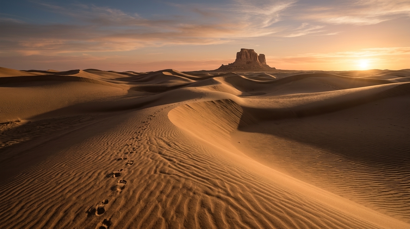
Leading lines perform double duty in wall art composition. First, they direct the eye through the frame, giving the composition movement and preventing it from feeling static at distance. Second, they create implied depth by converging toward a vanishing point. Roads, rivers, fences, coastlines, and architectural edges all serve as natural leading lines. When shooting for print, position leading lines so they enter from a lower corner and move toward the primary subject, creating visual momentum rather than a dead end. At large acrylic print scale, a strong leading line often makes a viewer walk closer to examine where it goes. Some of the most compelling prints I’ve produced across 30-plus years follow this structure: a Wyoming ridgeline entering the lower-left corner, pulling the eye across 30 inches of acrylic to a dark peak at center-right.
Visual Hierarchy: Controlling Where the Eye Goes

Visual hierarchy in photography composition for wall art means establishing a clear primary subject, a secondary point of interest, and a supporting background, in descending order of visual weight. Viewers standing across a room need to identify the primary subject within the first second of looking at the image. If the composition doesn’t answer “what is this photo of?”, the eye wanders and the print loses authority on the wall.
Achieving strong visual hierarchy starts with deliberate use of contrast, size, sharpness, and position. A sharp subject against a soft background draws the eye because of sharpness contrast. Tonal contrast works similarly: a bright subject against a darker surround commands attention. Positional priority also matters: a subject placed at a rule-of-thirds intersection draws the eye before a centered one does. Using two or three of these tools together, a sharp, bright subject positioned at the upper third intersection, produces a hierarchy viewers rarely notice consciously, because the composition simply feels right.
One common wall art photography mistake is competing focal points. Two bright, sharp elements of similar size positioned symmetrically in the frame create visual ambiguity. At small screen size, the eye moves quickly between them. At large print scale, the ambiguity feels unresolved and unsettling. When composing for wall display, ask clearly: what is the one subject? Everything else in the frame should support rather than compete with the answer.
Why HD Acrylic Prints Reward Strong Composition

Artbeat Studios HD acrylic prints bring specific technical qualities to wall display: luminosity, depth, and color accuracy. The production process prints your image on archival Epson metallic paper, then face-mounts it under a layer of clear acrylic. The result is a print where the image appears to glow from within, with color saturation and tonal depth significantly beyond standard paper or canvas. For photographers who have been deliberate about composition, this process amplifies what’s working in the image.
Specifically, acrylic rewards images with clean negative space and strong tonal contrast. The luminous quality of the substrate interacts with open, lighter areas of the image, a bright sky, open water, or clean studio background gains a depth and dimension on acrylic impossible to replicate on matte paper. Similarly, subjects with strong edge separation from their backgrounds read with exceptional clarity under acrylic because the contrast and sharpness are preserved, not absorbed. For photographers using depth layering and strong visual hierarchy, HD acrylic turns a well-composed image into a piece whose presence in a room is immediately apparent.
Artbeat Studios has refined this process over more than 20 years of in-house California production. Their acrylic prints arrive ready to hang and offer multiple mounting options to suit different wall environments. Free shipping on orders over $150 makes the cost of printing a full-sized display piece more accessible. For practical guidance on where and how to display once you’ve ordered, the best ways to display your photography at home covers placement, spacing, and medium selection room by room.
Ready to Print Your Wall Art?
Order Artbeat Studios HD Acrylic Today
In-house production, archival materials, and gallery-quality luminosity built for images worth hanging. Free shipping on orders over $150.
Acrylic vs. Metal Prints: Which Suits Your Wall Art Best?

Both HD acrylic and HD metal prints from Artbeat Studios produce exceptional results, but they serve different compositional strengths. Metal prints amplify contrast and deliver a high-impact, graphic quality well suited to bold, high-contrast compositions, architecture, abstract work, and dramatic landscapes with strong shadow detail. Acrylic prints deliver luminosity and color depth suited to images with tonal subtlety, open highlights, and compositional breathing room. Portraits, seascapes, soft landscape work, and any image where the mood depends on light quality rather than graphic contrast tend to print more beautifully on acrylic.
From a composition standpoint, the choice also connects to how the image will live in the room. Metal prints have a more modern, graphic presence and work well in spaces with contemporary decor and strong artificial lighting. Acrylic prints read as more gallery-like and luminous, integrating naturally into spaces with natural light or warmer ambient conditions. Neither is universally superior. The right choice follows the image’s composition, mood, and the environment where it will hang.
For acrylic prints for photographers specifically, Artbeat Studios offers multiple size options and mounting styles, including float mounts producing a shadow gap between the print and wall. The float mount adds dimension to the acrylic piece and works particularly well for compositions using significant negative space, the shadow gap reinforces the sense of air and lightness the negative space creates inside the image.
Pros and Cons
Pros
- Shooting for print changes how you see, compositional thinking improves across all your photography
- Negative space, depth, and visual hierarchy are learnable skills with immediate results
- HD acrylic luminosity amplifies tonal subtlety and color depth in well-composed images
- Artbeat Studios in-house production ensures consistent quality across every order
- Float mount option reinforces negative space composition at display scale
- Free shipping over $150 makes large-format printing accessible
Cons
- Composing specifically for wall art requires a mental shift, screen-first habits take time to unlearn
- Acrylic reflects ambient light; display placement affects how the print reads in different lighting conditions
- Images with heavy detail across the entire frame need careful evaluation before printing large
- HD acrylic is priced above standard paper prints; the investment is appropriate for display-quality work
Final Verdict

Photography composition for wall art is the discipline most photographers skip and most print buyers notice. A technically excellent image with weak composition fails at display scale in ways a monitor never reveals. Conversely, an image built with negative space, layered depth, and clear visual hierarchy gains authority at large format, it looks like it was always meant to be on a wall, because it was. Over 30 years of shooting and more than a decade of teaching these techniques alongside photographers across the world, the photographers producing the most compelling prints are consistently the ones who thought about the wall before they pressed the shutter.
The techniques in this guide aren’t complicated. Negative space is a decision made at the moment of framing. Depth layering is a choice about how far back to stand. Visual hierarchy is knowing which one element deserves to dominate the frame. None of these require new gear or advanced technical knowledge. They require intention, and intention is free.
When it comes to the print itself, Artbeat Studios HD acrylic is the right substrate for the compositional qualities this article covers. The luminous, gallery-quality finish amplifies color depth and tonal subtlety in images with strong negative space and clear hierarchy. The 20-plus years of in-house California production behind every print means the quality matches the intention you put into the composition. If you’ve shot an image worth hanging, HD acrylic is how you give it the display it deserves.
Ready to Buy?
Check Today’s Price on Artbeat Studios HD Acrylic
Free shipping over $150. All prints produced in-house in California. Gallery-quality luminosity, archival materials, multiple mounting options.
Frequently Asked Questions
What makes a photo good for large wall art printing?
Strong wall art photography tips consistently point to four qualities: clear visual hierarchy (one dominant subject), intentional negative space, depth through foreground and background layering, and clean edges with no distracting corner elements. Images with these qualities hold attention at 8 to 10 feet of viewing distance and reward close inspection equally well. High resolution also matters, 20 megapixels or more ensures sharpness at large format sizes like 24×36 inches.
How does negative space affect wall art composition?
Negative space gives a large print room to breathe on the wall. Without it, a busy image competes visually with everything in the room. With strong negative space, the subject reads clearly at distance and the print integrates into the space rather than overwhelming it. For acrylic prints specifically, open highlight areas in negative space regions gain a luminous depth the substrate is known for.
Should I use the rule of thirds for wall art?
The rule of thirds is a strong default for shooting for print because it positions the subject off-center, creating visual tension and leaving negative space on the opposite side. However, intentional center composition works equally well when paired with strong negative space above or around the subject. The key is deliberateness, centered compositions need stronger supporting elements to hold attention at wall scale than off-center compositions do.
Why are acrylic prints good for photography wall art?
Acrylic prints for photographers offer a luminous, gallery-quality finish the acrylic face-mounting process creates by printing on archival metallic paper and covering with clear acrylic. The image appears to glow from within. Colors are more saturated, tonal depth is greater, and edge sharpness is preserved. These qualities specifically reward images with strong composition, clean negative space, layered depth, and clear subject hierarchy all read more powerfully on acrylic than on matte paper or canvas.
What resolution do I need for large-format wall art prints?
For prints up to 16×24 inches, 12 megapixels is generally sufficient at standard viewing distances. For prints at 24×36 inches and above, 20 to 24 megapixels produces noticeably sharper results at close viewing distances. Most modern mirrorless and DSLR cameras exceed these thresholds. Smartphone cameras with 12 to 48 megapixel sensors are adequate for prints up to 20×30 inches when the image is sharp at capture.
What’s the difference between acrylic and metal prints for wall art?
Metal prints amplify contrast and graphic impact, making them ideal for bold, high-contrast compositions, architecture, abstract work, and dramatic landscapes. Acrylic prints deliver luminosity and color depth suited to tonal subtlety, portraits, and images where light quality drives the mood. Both are produced in-house by Artbeat Studios in California and offer free shipping over $150. The right choice follows the composition and mood of the image, as well as the lighting conditions in the display space.
Just so you know, some of the cool stuff we mention comes with affiliate links, meaning we earn a commission if you buy (no extra charge to you!). Plus, we occasionally feature sponsored content, but rest assured, we only shout out products we genuinely stand behind.