



Over the past three decades, I’ve carried a camera just about everywhere I’ve gone. Those experiences did far more than fill hard drives. They forced me to confront a question no camera manual addresses: why do some photographs endure? Why do others, technically perfect by every measurable standard, feel forgettable within a year? The answer has nothing to do with gear. I’ve seen disposable-camera images that stop people cold and medium-format files that nobody wanted to look at twice.
What makes a photograph truly timeless is a question worth sitting with seriously, because the answer shapes every decision you make behind the lens. It governs whether you press the shutter or wait, whether you simplify or complicate the frame, whether you chase the moment or the aesthetic.
After years of shooting, reviewing, and printing my best work, I’ve come to believe that timeless photographs share a handful of consistent traits. None are trending. None are technological. All of them are teachable. Understanding those traits also changes how you think about what to do with your strongest images. A photograph that deserves to endure deserves to live somewhere better than a cloud folder.
Quick Facts:
- Topic: What makes a photograph timeless, covering light, emotion, composition, and restraint
- Skill level: All levels, beginner to advanced
- Key concepts: Emotional universality, compositional restraint, honest light, avoiding trend dependency
- Print partner: Shiny Prints (shinyprints.com), ChromaLuxe HD metal prints
- Best for: Photographers who want to create images with lasting power and display them properly
- Shiny Prints sizes: 8×8 to 48×96, custom shapes, limited lifetime warranty
8 min read
In This Article
- What Timeless Photography Actually Means
- Emotional Universality: The First Ingredient
- Honest Light Over Dramatic Light
- Compositional Restraint: Less Is What Lasts
- Avoiding Trend Dependency
- The Decisive Moment and Why It Still Matters
- Printing Timeless Images: Why the Medium Matters
- Final Verdict
- Frequently Asked Questions
What Timeless Photography Actually Means
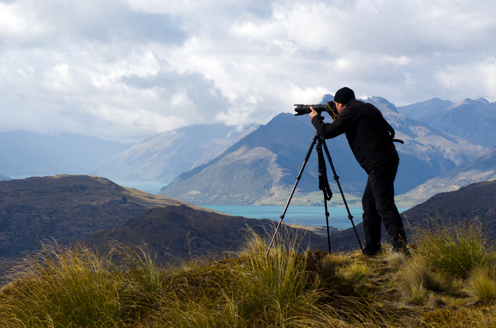
The phrase “timeless photograph” gets used loosely, so it’s worth defining precisely what it describes. A timeless photograph feels immediately relevant regardless of when it was taken. Such an image doesn’t rely on a recognizable trend, a particular era of editing, or a cultural moment to generate interest. Viewers who know nothing about when or where the image was made still respond to it. The emotional content, the compositional structure, and the quality of light speak a language that doesn’t expire.
What makes a photograph timeless is not the absence of a specific time and place. The most enduring photographs often have a deeply specific location and moment embedded in them. Ansel Adams’s landscapes are rooted in particular valleys and particular mornings. Dorothea Lange’s portraits document a specific era of American poverty. Their images endure because the specific becomes universal. The subject is concrete enough to be real, and the emotion is broad enough to be shared. That combination, specificity in subject and universality in feeling, is the structural secret of images that outlast the decade they were made in.
What Timeless Photography Is Not
Timelessness is also worth defining by what it excludes. A photograph tied to a trending editing style ages as fast as the trend. Heavy teal-orange color grading, extreme desaturation, artificial sky replacements, and plastic skin smoothing all produce images that feel fresh in the year they’re popular and hollow within three years. Similarly, photographs built around a visible technological marker, a prominent smartphone, a brand-specific logo, a social media UI element, are immediately dated by those details. Removing temporal anchors from your images doesn’t mean removing all specificity. It means asking whether the image’s emotional power depends on the viewer recognizing something that won’t exist in twenty years.
Emotional Universality: The First Ingredient

The most consistently cited characteristic of timeless photography is emotional universality. This means the dominant emotion or mood in the image, whether tenderness, awe, solitude, grief, joy, or longing, is one that viewers across cultures and eras recognize without needing context. You don’t need to know who the subject is or where the photograph was taken. The feeling reaches you before the information does.
Emotional universality is why portrait photographers return again and again to faces rather than settings. It also explains why the strongest landscape images feel inhabited even when no person appears. A wide, empty plain under a storm sky doesn’t need a human figure to produce a feeling of solitude. The visual language of scale, of vast space against a small horizon, communicates something the brain processes before the conscious mind names it. When you’re evaluating your own photographs, ask whether someone who has never met the subject and never visited the location would feel something looking at the image. If the answer is no, the image is personal but not universal. Both have value. Only one is timeless.
Simplicity as the Carrier of Emotion
Emotional universality and visual simplicity are closely linked. An image crowded with competing subjects, overlapping points of interest, and unresolved background distractions asks too much of the viewer. Attention fragments. Feeling dilutes. The photographs that endure tend to have one dominant subject or idea. Everything else in the frame serves that subject or recedes behind it. Henri Cartier-Bresson’s street photographs are instructive here: even at their most complex, they have a clear visual hierarchy. The eye knows immediately where to go, and the emotion follows from that clarity. Simplicity isn’t about removing detail. It’s about removing ambiguity.
Honest Light Over Dramatic Light
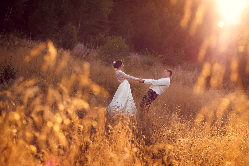
Light is the fastest variable separating timeless photographs from forgettable ones. The instinct among newer photographers is often to chase dramatic light: the most saturated sunset, the most theatrical storm, the most extreme contrast. Dramatic light produces striking images. It also produces images that rely on spectacle rather than subject, and spectacle ages badly. The photographs that endure across decades tend to use light that serves the subject rather than overpowering it.
Soft window light on a face reveals texture and emotion without flattening the person into a silhouette or drowning them in color. Overcast light on a landscape produces subtle tonal transitions that hold up in large-format prints because there are no blown-out highlights to hide. Late afternoon directional light adds dimension and warmth without the garish intensity of midday sun. In each case, the light is honest. It describes the subject rather than replacing it. When I look back at my strongest images from thirty years of shooting, something stands out. The frames that still hold my attention are almost never the most dramatic ones on the card. They’re the frames where the light revealed something true.
Compositional Restraint: Less Is What Lasts

Compositional restraint is one of the most reliable predictors of a photograph’s longevity. The enduring compositional frameworks, rule of thirds, leading lines, negative space, geometric balance, symmetry, aren’t popular because they’re arbitrary rules. They’re popular because they align with how the human visual system navigates a two-dimensional image. They direct attention, create rhythm, and give the eye a place to rest. These frameworks don’t go out of style because the visual system doesn’t go out of style.
Specifically, negative space is one of the most powerful and underused tools for creating images with lasting impact. When a photographer gives the subject room to breathe, when the frame isn’t fighting itself for dominance, the viewer’s attention settles on what matters. A bird in flight against a clean sky, a lone figure on an empty road, a single tree in a field: none of these compositions require explanation. The visual logic is immediate, and the emotional logic follows. Contrast this with compositions so dense with information that you need to study them to understand what you’re supposed to feel. Dense photographs reward extended attention, but they rarely stop people cold on first encounter the way a clean, restrained composition does.
Print Direct from Shiny Prints
Your Strongest Images Deserve a Surface That Lasts
Shiny Prints uses ChromaLuxe HD aluminum panels rated to last over 65 years and Epson F-Series printers for color depth paper and canvas don’t match. Sizes from 8×8 to 48×96.
Avoiding Trend Dependency
Every era of photography has its signature editing aesthetic, and every era’s signature aesthetic eventually becomes its timestamp. Heavy vignettes and crushing contrast from the early HDR era look unmistakably dated now. Faded, washed-out film emulation popular on Instagram around 2013-2015 announces its year loudly. The teal-orange split-tone grading dominant from roughly 2015 onward is already starting to read as a period marker. None of these styles are bad. Some produce genuinely beautiful images. The brain codes visual style as quickly as it codes visual content, and when a style becomes associated with a particular era, that association applies to every image carrying that style’s signature. The issue is dependency: when an image’s emotional power lives primarily in the processing style rather than in the light, subject, or moment, removing that style collapses the image.
Timeless photography tips on avoiding trend dependency almost universally point in the same direction: process for clarity and honesty rather than mood manufacture. This doesn’t mean flat, lifeless editing. It means asking whether the edit supports what was there or invents something that wasn’t. Balanced contrast, accurate color, purposeful shadows, and subtle tonal harmony age well because they don’t announce a particular year. They describe a particular subject. The test is simple: strip your edit back to a straight, balanced conversion and ask whether the image still works. If it does, the photograph is strong. If it doesn’t, the processing is doing structural work the image doesn’t support on its own.
The Decisive Moment and Why It Still Matters

Henri Cartier-Bresson’s concept of the decisive moment remains the most useful single idea in photographic education. It describes the instant when form, light, and human action converge into a single perfect frame. It describes something every experienced photographer recognizes. There is a moment when everything in a frame aligns. There are thousands of moments before and after it when almost everything does, but not quite. The difference between those frames is often invisible until you see both side by side. One image stops you. The other one is technically fine and instantly forgettable.
The decisive moment concept applies beyond street photography, which is the context where it’s most often discussed. It applies to landscape photography, where the light quality changes by the minute and the gap between an interesting image and a transcendent one is sometimes thirty seconds. Portrait photography works the same way: the subject’s expression cycles through openness, guardedness, and genuine connection repeatedly, and the photographer’s job is to recognize the authentic moment before it passes. It applies to wildlife photography, where the difference between a catalog image and an icon is the alignment of behavior, light, and frame. In every discipline, the decisive moment is the variable that separates images with staying power from images that are technically accomplished but emotionally inert.
Printing Timeless Images: Why the Medium Matters

Understanding what makes a photograph timeless eventually raises a practical question: if you’ve made an image you believe will endure, what do you do with it? A digital file on a hard drive isn’t a display object. It doesn’t occupy space in a way that commands attention. It doesn’t age into something you return to repeatedly the way a physical print does. Research on how people relate to photographs consistently shows that physical prints form stronger emotional bonds than digital files. A print you look at every morning on your way out the door works on you over years in a way a screen image never will.
For photographs built to last, the printing medium matters as much as the image itself. ChromaLuxe aluminum panels, the substrate used by Shiny Prints, are rated to last over 65 years without fading or color shift, verified by the Wilhelm Research Institute. That longevity matches the ambition of a timeless image. If you’ve made a photograph that deserves to outlast the decade, a surface that outlasts multiple decades is the right home for it. Metal printing also produces a depth of color and tonal range that paper and canvas printing doesn’t match. The blacks are deeper, the highlights cleaner, and the mid-tone transitions hold detail that compresses or muddies on other substrates. If you want to understand what types of images work best on metal, strong compositional images with clear tonal separation are consistently at the top.
Why Shiny Prints Is the Right Lab for Your Best Work
Not all metal print labs are equal, and the difference matters when the image matters. Shiny Prints specializes exclusively in metal, which means their entire operation is built around getting this one process right. Their printers are Epson F-Series, paired with ChromaLuxe panels, the combination that produces the widest color gamut and sharpest shadow detail in the dye-sublimation industry. In six years of print reviews on PhotographyTalk, fewer than five perfect scores have been awarded across all formats tested. Shiny Prints has received two of them. That’s the kind of track record worth knowing about when you’re committing a photograph you’ve worked hard to create. Check our six-year metal print shootout to see how they compare against every other major lab. For an in-depth look at the product itself, our full Shiny Prints review covers everything from color accuracy to packaging to long-term durability.
Final Verdict

What makes a photograph truly timeless comes down to five things working together: emotional content that transcends cultural context, honest light that describes rather than spectacle, compositional restraint that gives the viewer’s eye somewhere clear to go, editing choices that don’t announce a particular year, and the presence of a decisive moment where form and feeling converge. None of these traits require expensive gear or a particular location. They require attention, patience, and the discipline to wait for a frame that does all five at once rather than settling for one that does two or three.
The photographers who consistently produce timeless work share one more characteristic: they treat their strongest images as objects worth protecting. They print them, display them somewhere they see them daily, and commit to the image physically in a way that the photographer who leaves everything on a hard drive never does. A timeless photograph deserves a timeless surface. Why metal prints stand the test of time becomes clear the first time you hold one: the color doesn’t fade, the surface doesn’t warp, and the image doesn’t compress into something smaller than what you captured. Shiny Prints is where that commitment belongs. Their free shipping over $99, limited lifetime warranty, and print sizes from 8×8 to 48×96 make the decision easy.
If you’ve made a photograph you believe will still matter in twenty years, honor that belief by printing it on something built to last that long.
Ready to Print Your Best Work?
Turn Your Timeless Shots Into Wall Art That Lasts Decades
ChromaLuxe panels rated 65+ years. Free shipping over $99. Limited lifetime warranty. Sizes from 8×8 to 48×96 with custom options available.
Frequently Asked Questions
What makes a photograph truly timeless?
What makes a photograph timeless comes down to five qualities working together. Those qualities are emotional universality, honest light, compositional restraint, editing choices that avoid trend dependency, and a decisive moment where form and feeling converge. The image conveys a feeling: awe, tenderness, solitude, joy. Viewers across cultures recognize these emotions without needing context. It also avoids temporal anchors: processing styles, visible technology, or brand markers that tie it to a specific year. When those elements align with a decisive moment where light, form, and feeling converge, the result is an image that holds its power across decades.
Is black and white photography more timeless?
Black and white photography has an inherent advantage in longevity because it removes color trends from the equation. Without color grading to date the image, the fundamental elements, form, light, texture, and emotion, carry the full weight. However, color photography is equally capable of timelessness when the color choices are honest and balanced rather than trend-driven. The issue isn’t color versus monochrome; it’s whether the image relies on a processing style that will feel dated rather than on the strength of what was in the frame.
How does composition affect whether a photo is timeless?
Compositional frameworks that align with natural visual processing, rule of thirds, leading lines, negative space, geometric balance, endure because the human visual system doesn’t change. These frameworks direct attention clearly and give the eye a place to settle. Images with strong, restrained composition tend to reward the viewer immediately on first encounter and continue rewarding repeat viewings. Compositions that are dense, ambiguous, or over-complicated might be intellectually interesting but rarely achieve the kind of immediate emotional impact that characterizes the most enduring photographs.
What editing choices make a photograph feel timeless?
Timeless photography tips on editing consistently point toward balanced contrast, accurate color, purposeful shadows, and subtle tonal harmony. These choices describe the subject rather than manufacturing a mood that wasn’t present. The test is to strip your edit to a straight, balanced conversion and ask whether the image works without the processing. If it does, the photograph is strong. If the edit is doing structural work the image doesn’t carry on its own, the result will feel dated when the trend behind that edit moves on.
Should I print my best photos on metal for longevity?
Yes, for images you consider your strongest work. ChromaLuxe aluminum panels, used by labs like Shiny Prints, are rated to last over 65 years without fading or color shift. That longevity is genuinely matched to the ambition of a timeless image. Metal printing also preserves tonal depth and color accuracy at a level paper and canvas don’t achieve. The deep blacks, clean highlights, and precise mid-tone transitions that define strong photographic light translate to metal better than to any other substrate. If the image matters to you twenty years from now, it deserves a surface that will still be intact twenty years from now.
How do I know if my photo has timeless qualities?
Ask four questions. First: does someone unfamiliar with the subject or location feel something looking at the image? Second: does the composition direct the eye clearly without ambiguity? Third: does the light describe the subject honestly, or does it replace the subject with spectacle? Fourth: if you remove the processing and look at a straight conversion, does the image hold? A photograph that answers yes to all four has the structural ingredients of timeless photography. Whether it endures depends on the image’s emotional depth, and that’s something you’ll feel before fully articulating it.
Heads up: Clicking on our affiliate links and exploring our sponsored content helps us at no extra cost to you, and we only recommend gear we’re absolutely crazy about!

