

Before a viewer registers your subject, they register your colors. Color psychology in photography explains why a frame full of warm amber light feels different from the same scene rendered in cold blue, even when nothing else in the composition changes. After decades behind the lens, I’ve learned this lesson the slow way: palette speaks first, and the subject speaks second. While teaching photographers at every level, from nervous beginners to working pros, I’ve watched this realization land again and again. Once you start reading color as a language, you stop seeing scenes and start seeing stories.
My education in color deepened when I started reviewing prints. Over six years and nearly 200 print reviews, I’ve seen how a palette behaves once it leaves the screen. Metal taught me the most, since color renders there with more depth and luminosity than on any other substrate I’ve tested. Printing exposes every color decision you made in the field and in the edit. Because of this, I want to walk you through how color shapes emotion and why so many photographers oversaturate their images. Then we’ll cover how to build a palette with intent before you ever press the shutter.
Quick Facts:
- Topic: Color psychology in photography
- Skill level: Beginner through advanced
- Core idea: Viewers respond to palette before subject
- Key concepts: Warm vs. cool tones, saturation, harmony, contrast
- Most common mistake: Oversaturation
- Time required: 8 minutes to read, one shoot to apply
- Cost: Free to apply; Shiny Prints metal prints start at $16 for an 8×8
- Best for: Photographers who want images to communicate emotion on screen and in print
8 min read
In This Guide
- Color Psychology in Photography Overview: Why Palette Reads First
- Key Color Associations at a Glance
- How Warm and Cool Colors Set the Mood
- Saturation: The Most Misused Slider in Photo Editing
- Color Harmony and Contrast: Building a Palette on Purpose
- How Color Psychology in Photography Translates to Prints
- Saturated vs. Muted Palettes: Which Should You Choose?
- Pros and Cons of Shooting Palette First
- Final Verdict
- Frequently Asked Questions
Color Psychology in Photography Overview: Why Palette Reads First

Color psychology in photography studies how hue, saturation, and brightness shape a viewer’s emotional response to an image. By contrast, color theory tells you which colors look good together. Psychology explains why those combinations make people feel something. The distinction matters, because a technically beautiful color palette still fails when it triggers the wrong emotion for the story you’re telling.
This guide is for any photographer who wants more intentional images: landscape shooters chasing light, portrait photographers building mood, and hobbyists wondering why some edits feel right while others feel off. Research supports what working photographers learn through repetition. For example, a widely cited study in the journal Management Decision found people form judgments within 90 seconds. In those snap assessments, color does most of the work.
Here’s a scenario you’ve probably lived. You return from a shoot with a strong sunset frame, push the saturation slider, and the image suddenly pops on your monitor. A week later, the same edit looks harsh and unnatural, although you swore it was perfect when you exported it. Your colors outran your story. As a result, the emotional note you wanted, warmth and calm, became noise instead.
Finally, your color palette follows your image beyond the screen. A print hangs on a wall for years, so a color mistake on paper or metal lives a much longer life than a color mistake on Instagram. Throughout this guide, I’ll flag where each principle matters most for printing, since print is where palettes either prove themselves or fall apart.
Key Color Associations at a Glance
Individual colors carry consistent emotional weight across most Western audiences. Cultural context shifts some meanings, yet the broad associations below hold up consistently in my teaching experience. Use this table as a starting point, not a rulebook.
| Color | Common Emotional Association |
|---|---|
| Red | Energy, urgency, passion; raises physiological arousal |
| Orange | Warmth, comfort, late-day light, autumn |
| Yellow | Optimism, attention, brightness |
| Green | Calm, nature, renewal, balance |
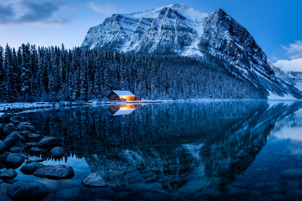
| Blue | Serenity, trust, distance, melancholy in deeper shades |
| Purple | Mystery, richness, twilight |
| Muted / neutral tones | Nostalgia, quiet, timelessness |
Print-Ready Color
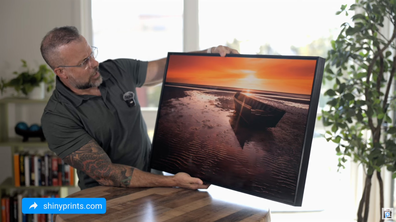
See Your Palette on Metal
Shiny Prints renders color on ChromaLuxe aluminum with the depth and accuracy to keep the emotion you built in the edit alive on the wall.
How Warm and Cool Colors Set the Mood
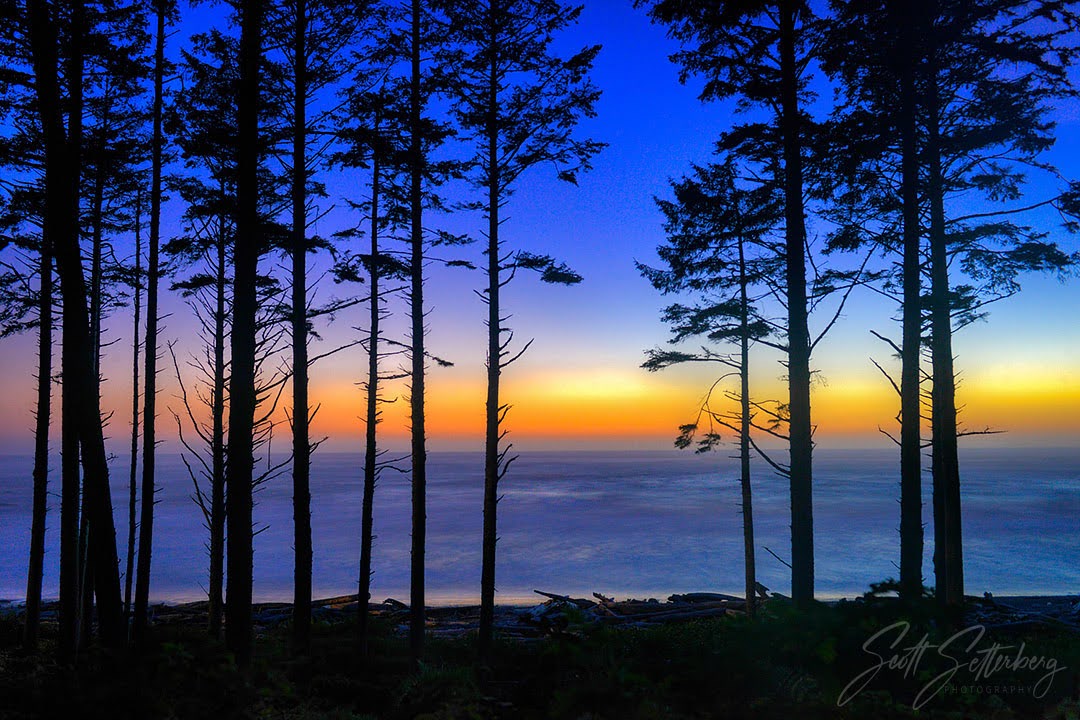
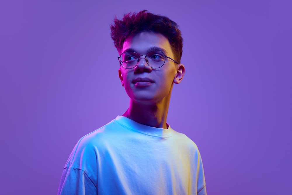
Warm colors, the reds, oranges, and yellows, read as active and emotionally charged. They pull the eye forward and raise the energy of a frame. Cool colors, the blues, greens, and violets, recede and quiet things down. Because warm tones appear less often in nature than cool ones, even a small patch of warmth inside a cool scene becomes a magnet for attention.
In practice, this gives you a simple lever. Want a portrait to feel intimate and inviting? Lean warm, the way late-afternoon sun does on its own. Want a seascape to feel vast and lonely? Hold the blues and resist the urge to warm the shadows. Neither direction is wrong; instead, each one tells a different story from identical raw material.
White balance is the cheapest tool you own for this. Shifting a single frame from 5500K toward 3800K changes its emotional temperature without touching a single saturation or hue slider. During my workshops, I often process one image both ways and ask the room what each version says. The answers are never the same, which proves the point better than any lecture.
Saturation: The Most Misused Slider in Photo Editing
Now for my strongest opinion in this guide: most photographers oversaturate their colors. I see it constantly in student work, in online portfolios, and honestly, in my own early edits. Saturation feels like free emotion. Push the slider, and the image appears more alive on a bright monitor. The problem is your viewer’s eye recalibrates within seconds, and after the novelty fades, oversaturated color reads as artificial rather than vivid.
Restraint carries more psychological weight than intensity. A muted palette with one controlled pocket of strong color directs emotion with precision, while a frame where every hue screams at full volume directs nothing. Specifically, try this exercise on your next edit: raise saturation to where it looks right, then pull it back 10 to 15 points. Live with the quieter version for a day before choosing.
Print makes this discipline non-negotiable. Monitors emit light, while prints reflect it, so an edit sitting at the edge of believability on screen tips into cartoon territory on paper or metal. Metal in particular rewards bold color so generously, as I explain in my breakdown of why metal prints favor bold color, the substrate adds vibrancy you didn’t ask for. Therefore, an oversaturated file on metal doubles the error. Edit for the print, and the screen version takes care of itself.
Color Harmony and Contrast: Building a Palette on Purpose
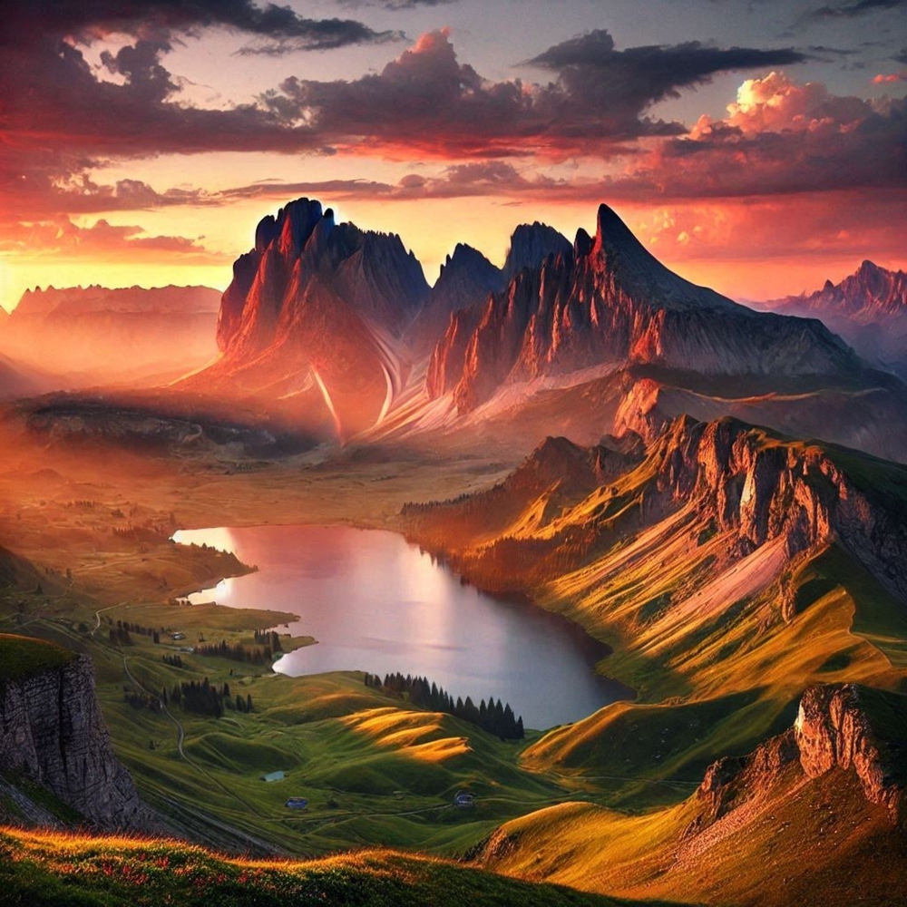
Harmony describes how the colors in your frame relate to each other on the color wheel. Complementary pairs, such as blue and orange or purple and yellow, sit opposite one another and generate visual tension. Analogous groupings, such as green through teal through blue, sit side by side and generate calm. Both approaches work; the choice depends on the emotion you’re after.
Complementary contrast is the engine behind most images people describe as striking. A small orange figure against a wall of blue ocean carries enormous pull, although the warm element occupies a fraction of the frame. Meanwhile, analogous palettes do the opposite job. They let a viewer settle into an image slowly, which suits quiet landscapes, fog, and contemplative portraits.
Color theory gives you the map for these relationships, while psychology tells you which destination fits your story. Before pressing the shutter, name the dominant color in the scene and its strongest companion. If the pairing fights the mood you want, change position, change light, or wait. Above all, choose the relationship on purpose rather than inheriting whatever the scene hands you.
Trusted by PhotographyTalk
Put Your Strongest Palette on the Wall
Shiny Prints reviews every file for quality before printing, so the color relationships you built survive the trip from screen to ChromaLuxe metal.
How Color Psychology in Photography Translates to Prints
Everything above gets tested the moment you print. Color psychology in photography lives or dies on the wall, because a print removes the backlight, the scrolling, and the forgiving glow of a phone screen. What remains is your palette, fixed in place, viewed in changing room light, day after day. I’ve reviewed nearly 200 prints across canvas, paper, acrylic, and metal, and palette discipline separates the prints people stop in front of from the prints people walk past.
Substrates interpret color differently. Matte paper softens and mutes, canvas absorbs and warms, and metal amplifies. Dye-sublimation on ChromaLuxe aluminum produces deep blacks and luminous color, which is why bold, high-contrast palettes thrive there. My guide to which images look best on metal covers the subject side. In short, saturated sunsets, neon nights, and high-contrast seascapes belong on metal, while whisper-quiet pastel work sometimes suits softer media.
Equally important, your lab choice decides whether your color intent survives at all. Shiny Prints earned perfect 30/30 scores from me twice across years of testing, largely on color accuracy. Moreover, their recent switch to the Epson F9570 widened the color gamut while keeping neutrals honest. Accurate neutrals matter as much as vivid primaries, since a color cast in the grays poisons every other relationship in the palette.
Saturated vs. Muted Palettes: Which Should You Choose?
The biggest differences come down to energy, longevity, and display context. Saturated palettes deliver immediate impact, command attention from across a room, and pair beautifully with metal’s amplifying nature. However, they demand precision, because every flaw in a loud palette is loud too. In contrast, muted palettes trade impact for staying power. They reveal themselves gradually, suit living spaces where a print is seen daily, and age gracefully as tastes shift.
Choose saturated when the story is energy: storm light, city neon, autumn at full burn. Reach for muted when the story is memory or quiet: fog, winter, family portraits meant to hang for decades. For prints headed to a client’s home, I lean muted more often than my younger self would believe, and my beginner tips for printing photos explain how to adjust brightness and color for each finish. On value, neither costs more to shoot; the price difference only appears in print size and substrate, where bold palettes justify going big.
Pros and Cons of Shooting Palette First
Shooting palette first means choosing the color story before composing the subject. After decades of trial and error, here is my honest scorecard for the approach.
Pros
- Viewers form impressions within 90 seconds, and palette drives most of them
- A 10-15 point saturation pullback consistently improves print results
- One warm accent in a cool frame creates instant focal pull with zero extra gear
- White balance shifts (5500K to 3800K) change mood without degrading the file
- Palette-first images translate to metal prints with fewer editing surprises
- Builds a recognizable personal style faster than chasing subjects
Cons
- Slows you down; expect fewer frames per outing at first
- Cultural color associations vary, so one palette won’t read identically worldwide
- Easy to overcorrect into desaturated, lifeless edits while breaking the oversaturation habit
- Some genres (events, wildlife) rarely allow palette control in the field
- Requires a calibrated monitor to trust what you’re seeing
Final Verdict
Thinking in palettes is for any photographer who wants images to communicate before the subject is even identified. Its biggest strength is leverage: color decisions cost nothing, apply to every genre, and compound across an entire body of work. Of all the skills I teach, this one changes student portfolios fastest.
The real trade-off is patience. Palette-first shooting slows your process, and breaking the oversaturation habit feels like losing punch before it feels like gaining taste. Photographers who shoot fast-moving, uncontrolled subjects will apply these ideas mostly in the edit, not the field. Also, anyone editing on an uncalibrated laptop screen should fix the monitor before trusting any color judgment.
On value, the return is hard to beat. A free shift in how you see, plus a 15-minute editing habit, produces images worth printing large. When a palette earns the wall, give it a substrate built for color; metal is my pick, and my full Shiny Prints review explains why they’ve earned perfect scores from me twice. If your work leans soft and pastel, a fine-art matte paper from a quality lab is the alternative worth considering.
Ready to Print?
Turn Your Strongest Palette Into a Metal Print
Every print carries a limited lifetime warranty, orders over $99 ship free, and custom sizes go up to 48×96 inches.
Frequently Asked Questions
What is color psychology in photography?
Color psychology in photography is the study of how hue, saturation, and brightness influence a viewer’s emotions. It differs from color theory, which covers which colors combine well visually. Psychology explains why a warm sunset feels comforting while a blue-hour frame of the same beach feels distant and quiet.
What emotions do warm colors evoke in photos?
Warm colors, including red, orange, and yellow, evoke energy, comfort, intimacy, and urgency. They advance toward the viewer and dominate attention, so even a small warm element inside a cooler frame becomes the focal point. Portrait and golden-hour work leans on this effect heavily.
Why do cool colors feel calming in photography?
Cooler hues, such as blue and green, recede visually and carry associations with sky, water, and vegetation, which most viewers connect with rest and safety. Deeper blues also introduce distance or melancholy, which is why moody seascapes and winter scenes lean cool almost by default.
How does saturation affect the mood of a photo?
Higher saturation raises perceived energy, while lower saturation reads as nostalgic, quiet, or timeless. The risk runs one direction: oversaturated color quickly registers as artificial, especially in print, where reflective media expose edits a backlit monitor forgives. Pulling saturation back 10 to 15 points from your first instinct is a reliable correction.
What colors look best on a metal print?
Bold, high-contrast palettes perform best on metal, including saturated sunsets, deep-black night scenes, and vivid water. Dye-sublimation on ChromaLuxe aluminum amplifies color depth and luminosity, so strong palettes gain impact while overly soft palettes sometimes lose presence. Labs focused on metal, such as Shiny Prints, hold color accuracy through this amplification.
Friendly disclaimer: Our articles may contain affiliate links that support us without costing you more, and sometimes we spice things up with sponsored content—but only for products we truly stand behind!