



After decades in the photography industry, one question comes up more than any other. Students ask it. Clients ask it. Photographers who’ve spent years shooting and still feel something is missing ask it too: why do certain photographs stop you immediately, while others get scrolled past?
I’ve been on both sides of that equation, shooting tens of thousands of frames across genres and conditions, and sitting on the editorial side evaluating images for publication, competitions, and print. The gap between a photograph that grabs you and one that doesn’t isn’t a matter of luck or expensive gear. It’s a matter of understanding what the human visual system responds to, and then making deliberate choices to give it exactly that.
Why some photos instantly grab your attention is a question with real, teachable answers. The brain processes images in milliseconds, and in that window, specific visual signals either trigger engagement or don’t. Subject placement, light quality, color relationships, tonal contrast, and compositional clarity all play a role.
Each is something you control before you press the shutter. Understanding those triggers changes how you shoot. It also changes how you think about displaying your strongest work. A photograph that genuinely commands attention on a three-inch screen commands a room when printed large. That’s not a coincidence. It’s physics.
Quick Facts:
- Topic: The science and psychology behind why some photos grab attention immediately
- Skill level: All levels, beginner to advanced
- Key concepts: Visual hierarchy, contrast, color, subject clarity, light, compositional psychology
- Print partner: Shiny Prints (shinyprints.com), ChromaLuxe HD metal prints
- Best for: Photographers who want to create more impactful images and display their strongest shots properly
- Shiny Prints sizes: 8×8 to 48×96, custom shapes, limited lifetime warranty
8 min read
In This Article
- How the Brain Processes a Photograph
- Subject Clarity: The Brain Needs to Know Where to Look
- Tonal Contrast: The Fastest Visual Signal
- Color Psychology and Visual Dominance
- Light Quality and Emotional Register
- Compositional Flow: Guiding the Eye
- Why Attention-Grabbing Photos Belong on Metal
- Final Verdict
- Frequently Asked Questions
How the Brain Processes a Photograph

The brain doesn’t study a photograph the way you’d read a paragraph. Visual processing happens in stages, beginning with a pre-attentive sweep that takes place before conscious awareness kicks in. Within roughly 150 milliseconds of seeing an image, the visual cortex has already identified areas of high contrast, dominant color, and large-scale compositional structure. This happens without any deliberate effort on the viewer’s part. The signals that reach the brain first are the ones that determine whether the image earns continued attention or gets filtered out as visual noise.
This pre-attentive stage is governed by features the human visual system detects rapidly: edges, brightness differences, color saturation, size, and motion cues. Photographs that deliver strong signals in these categories during the first fraction of a second of viewing are the ones that grab attention. Those that don’t, regardless of their technical quality or conceptual depth, struggle to earn the milliseconds they need to be seen. Understanding this process is the foundation of why some photos instantly grab your attention and why others, equally well-composed and correctly exposed, fail to stop the scroll.
The Two-Stage Viewing Experience
After the pre-attentive sweep, the brain enters a second stage of viewing driven by sustained attention. This is when the viewer follows compositional flow, reads facial expressions, interprets environmental context, and forms emotional responses. Great photographs are designed for both stages. They deliver a strong enough pre-attentive signal to earn that second stage, then reward the extended look with depth, detail, and meaning. Images that nail the pre-attentive stage but have nothing behind it feel immediately impressive and immediately hollow. Images with depth and meaning but no pre-attentive hook get overlooked entirely. The goal is to win both phases.
Subject Clarity: The Brain Needs to Know Where to Look

The single most reliable predictor of immediate visual impact is subject clarity. When the brain looks at a photograph and the subject is immediately, unambiguously obvious, attention locks. When the subject is ambiguous, buried in a busy background, or placed without compositional intention, the brain doesn’t engage. It moves on. This is why photographers who consistently produce compelling photos talk about subject isolation, negative space, and figure-to-ground separation as foundational disciplines rather than stylistic options.
Subject clarity doesn’t require a minimal composition. Some of the most visually arresting images are dense with information. The key is that even in a complex frame, there’s a clear visual hierarchy. One thing is dominant. Everything else is subordinate. The eye is given a starting point and a path. Without that hierarchy, complexity reads as chaos, and chaos is the enemy of visual engagement. The practical tools for establishing subject clarity include depth of field control, background simplification, and using light to separate subject from environment. Negative space helps too. All of them work on the same principle: the clearer the subject, the stronger the hold on the viewer’s attention.
Tonal Contrast: The Fastest Visual Signal

Of all the pre-attentive features the brain detects, tonal contrast is among the fastest and most powerful. Bright areas attract the eye. Areas of high contrast between light and dark attract it even more strongly. This is why photographers talk about “finding the light.” Light doesn’t make everything look better. What it does is create tonal contrast, and tonal contrast creates a visual hierarchy the brain reads instantly. Think of a bright face against a dark background, a shaft of sunlight cutting across a shadowed street, or a white bird against a gray ocean. In each case, the contrast creates an entry point that demands attention before the viewer has made any conscious decision to look.
Understanding tonal contrast also explains why many technically well-exposed photographs fail to grab attention. An evenly lit subject against an evenly lit background has no tonal separation, no contrast-driven hierarchy, and no pre-attentive hook. The brain registers it as visually flat. Photographers who consistently create attention-grabbing images work with light to create deliberate tonal contrast. They place subjects where light separates them from their environment. They shoot in conditions where directional light creates shadows and highlights. When needed, they enhance the contrast relationship between subject and background in post-processing, without making the edit obvious.
Print Direct from Shiny Prints
Photos That Command Attention Deserve a Surface That Delivers
ChromaLuxe HD aluminum panels. Epson F-Series printers. Tonal depth and color accuracy paper and canvas don’t match. Sizes from 8×8 to 48×96.
Color Psychology and Visual Dominance

Color triggers the pre-attentive visual system in two distinct ways: through saturation and through relationship. A highly saturated color in an otherwise muted scene draws the eye before the viewer has decided to look at it. This is why a single red object in a gray cityscape stops you cold, the saturation contrast creates an automatic focal point. The brain is wired to detect color anomalies. Photographers who understand this use deliberate color placement as a compositional tool, not an accident of circumstance.
Color relationships are the second mechanism. Complementary colors, those opposite each other on the color wheel, generate a visual tension that holds attention. Warm orange against deep blue, yellow against violet. These pairings trigger the pre-attentive system more strongly than harmonious color combinations because the contrast is registered as significant. Nature provides some of the most powerful complementary color combinations automatically. Warm-toned subjects against blue skies, golden hour light on green vegetation, orange sandstone against a cobalt-blue desert sky. Photographs that align a strong subject with a strong complementary color relationship are working on multiple visual channels simultaneously, which compounds their attention-grabbing power. Look for scenes where your subject naturally aligns with a complementary color environment, then position yourself to make that pairing the frame’s dominant relationship.
Warm vs. Cool and Emotional Reading
Beyond saturation and complementary relationships, color temperature communicates emotional register before the viewer consciously interprets the image. Warm tones, reds, oranges, ambers, signal energy, intimacy, and urgency. Cool tones, blues, greens, teals, signal calm, distance, and spaciousness. A photograph where the dominant color temperature matches the intended emotional content works on a deeper level than one where the two are in conflict. Flat, desaturated color grading eventually reads as emotionally inert for the same reason. It removes the temperature signal entirely, leaving the viewer without the subconscious emotional cue that color delivers.
Light Quality and Emotional Register
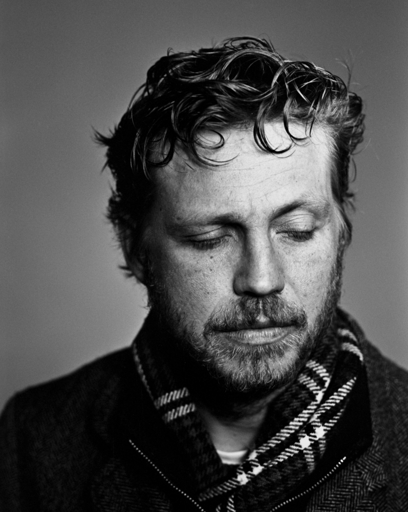
Light quality is the variable that separates photographs that grab attention and sustain it from those that grab attention and release it immediately. Strong tonal contrast creates the initial hook. What the light does once the eye is there determines whether the viewer stays. Harsh, overhead midday light produces contrast but not quality. It creates hard shadows in unflattering places, blows out highlights, and flattens texture. The eye notices the contrast and then finds nothing interesting to settle on. Soft, directional light does the opposite. It wraps around subjects, reveals texture and dimension, creates gradients that reward extended looking, and communicates mood in a way that flat or harsh light never achieves.
The golden hour effect is the most widely discussed example, but the principle extends further. Overcast light softens contrast and saturates colors in a way that makes subjects glow without specular harshness. Window light in a dim interior creates a luminous separation between subject and shadow that the eye reads as both beautiful and emotionally significant. Light through fog or haze adds atmospheric depth that makes photographs feel three-dimensional in a way that clear-day light rarely achieves. Each of these conditions produces light that goes beyond simple illumination. It sculpts, separates, and communicates. Photographs made in light that does all three are the ones that stop people. Not because the photographer got lucky, but because they understood what they were looking for.
Compositional Flow: Guiding the Eye

After the pre-attentive stage, compositional flow takes over as the primary driver of sustained attention. Compositional flow describes the visual path the eye takes through an image after the initial subject lock. Images with strong compositional flow feel coherent and rewarding to look at. Images without it feel visually stalled, the eye enters, finds the subject, and then has nowhere to go. The viewer disengages.
Leading lines are the most direct tool for creating compositional flow. Roads, rivers, fence lines, shadows, horizon edges: any element extending from the frame toward the subject creates a visual path the eye follows instinctively. Diagonal lines are more dynamic than horizontal or vertical ones because they create a sense of movement and tension. They push the viewer’s eye through the frame rather than letting it rest. The most attention-sustaining images use a combination of elements. An entry point created by contrast or color locks the viewer’s gaze. A leading line carries the eye toward the subject. A secondary element rewards the viewer for completing the visual journey.
Scale, Negative Space, and Visual Rest
Scale contrast is one of the most underused tools in compositional psychology. Placing a small subject against a vast environment creates an immediate emotional response to the scale relationship. A person on a mountain, a boat on an ocean, a tree in a field: all of these trigger that response. The brain registers the contrast between small and large and reads it as meaningful: isolation, scale, drama, solitude. This response happens pre-attentively and sustains into the extended viewing phase because the scale contrast continues to reward re-examination.
Negative space serves a related function. Photographs with strong negative space give the eye room to move, which paradoxically increases the viewer’s focus on the subject. When a frame is densely packed, attention splits across competing elements. When the subject has breathing room, attention concentrates. This is why portraits shot against clean, uncluttered backgrounds consistently out-perform portraits shot in cluttered environments when impact is the goal. The absence of competition for the eye’s attention intensifies the connection between viewer and subject.
Why Attention-Grabbing Photos Belong on Metal

The visual properties that make a photograph attention-grabbing on a screen become significantly more powerful at large format on metal. Tonal contrast deepens. Color saturation holds. Detail in shadows and highlights, the range that creates the sense of three-dimensional light, renders with a fidelity that screens compress and paper loses. This isn’t a subjective impression. ChromaLuxe aluminum panels, used by Shiny Prints, preserve color depth and tonal range at a level paper and canvas don’t match. Their rated display permanence is over 65 years. If you’ve made a photograph that commands attention, printing it on metal is what honors that quality. And if you’re wondering what types of images work best on metal, photographs with strong tonal contrast, saturated color, and clear subject hierarchy are consistently at the top of that list.
Shiny Prints specializes exclusively in metal printing , a focus that matters because their entire process is optimized for this one substrate. Their Epson F-Series printers deliver the widest color gamut and sharpest detail in the dye-sublimation industry. Every image submitted goes through an evaluation for imperfections, color accuracy, and size compatibility before printing begins. In six years of print reviews on PhotographyTalk, perfect scores have been awarded fewer than five times total across all formats tested. Shiny Prints has two of them. See how they compare against every other major lab in our six-year metal print shootout, and read the full product breakdown in our complete Shiny Prints review. For those new to the medium, what metal prints are and how they’re made explains the process and why dye-sublimation on aluminum outperforms every other format for impact-first photography.
Final Verdict

Why some photos instantly grab your attention comes down to five variables: subject clarity, tonal contrast, color relationships, light quality, and compositional flow. These aren’t mysterious principles. They’re learnable, repeatable, and present in every great photograph that ever stopped someone cold.
The photographers who consistently produce attention-grabbing images aren’t guessing. They work with an understanding of what the visual system responds to. They place themselves in conditions where those signals are most likely to align. When they get the shot, when subject, light, color, contrast, and composition all converge into a single frame, that image deserves a surface worthy of what it captured. Shiny Prints delivers exactly that, with ChromaLuxe HD panels rated for 65+ years, free shipping over $99, and print sizes from 8×8 all the way to 48×96. Your best images command attention. Give them the wall space to prove it.
Ready to Print Your Best Work?
Give Your Attention-Grabbing Shots the Wall They Deserve
ChromaLuxe panels rated 65+ years. Free shipping over $99. Limited lifetime warranty. Sizes 8×8 to 48×96. Custom shapes available.
Frequently Asked Questions
Why do some photos instantly grab your attention?
The brain processes images in two stages. The first stage, called pre-attentive processing, happens in roughly 150 milliseconds and identifies areas of high contrast, dominant color, and large-scale compositional structure before conscious awareness engages. Photographs that deliver strong signals in these categories during that first fraction of a second are the ones that earn continued viewing. The variables driving this response include tonal contrast, color saturation, subject clarity, and the presence of a clear visual hierarchy. When all of those align, the image stops the viewer before they’ve made any deliberate decision to look.
What makes a photo attention-grabbing?
What makes a photo attention-grabbing is five variables working together: clear subject, strong tonal contrast, purposeful color relationships, quality directional light, and compositional flow. No single variable guarantees visual impact, all five contribute, and the strongest photographs tend to deliver on at least three or four simultaneously. Subject clarity is typically the most important: when the brain cannot immediately identify what to look at, it disengages. After subject clarity, tonal contrast is the next most powerful attention driver.
How does color affect visual impact in photography?
Color affects visual impact through two mechanisms: saturation contrast and complementary color relationships. A highly saturated color in an otherwise muted scene draws the eye automatically because the brain is wired to detect color anomalies. Complementary color pairs, colors opposite each other on the color wheel, create a visual tension that compounds the pre-attentive signal and holds attention. Beyond saturation and complementary contrast, color temperature communicates emotional register before the viewer consciously processes the image. Warm tones signal energy and urgency. Cool tones signal calm and distance.
Does composition affect how quickly a photo grabs attention?
Composition affects how quickly a photo grabs attention and, more importantly, how long it holds it. Strong compositional flow creates a visual path that guides the eye from entry point through the frame to the subject and beyond. Leading lines, scale contrast, and deliberate negative space all contribute to this flow. Images with good compositional flow feel rewarding to look at because the viewer’s eye is directed rather than left to wander. Images without it often have strong pre-attentive signals that create an initial grab but fail to sustain engagement because there’s no path to follow after the initial look.
Why do metal prints make photos look more impactful?
Metal prints increase visual impact by preserving and enhancing the exact properties that make images attention-grabbing: tonal contrast, color saturation, and fine detail in shadows and highlights. ChromaLuxe aluminum panels used by labs like Shiny Prints render deep blacks, clean highlights, and color accuracy that paper and canvas substrates compress or lose. At large format, which metal printing handles particularly well, the pre-attentive signals that work on a phone screen become room-commanding. A photograph with strong tonal contrast and saturated color on a 30×40 or 40×60 metal panel doesn’t need to compete for attention. It owns the space it’s in.
What types of photos work best for large metal prints?
Photographs with strong tonal contrast, saturated or complementary color relationships, and clear subject hierarchy translate best to large-format metal prints. Landscapes with dramatic light, wildlife shots with clean backgrounds, architecture with strong geometric contrast, and portraits with deliberate subject-background separation are all consistently strong performers on metal. The format amplifies what’s already there, so images that work visually at smaller sizes become significantly more impactful at larger ones. Images that lack contrast or subject clarity, on the other hand, tend to reveal those weaknesses more clearly at larger scale, not less.
Our articles might have affiliate links and the occasional sponsored content, but don’t sweat it – if you buy something, we get a little kickback at no extra cost to you, and we only hype products we truly believe in!

